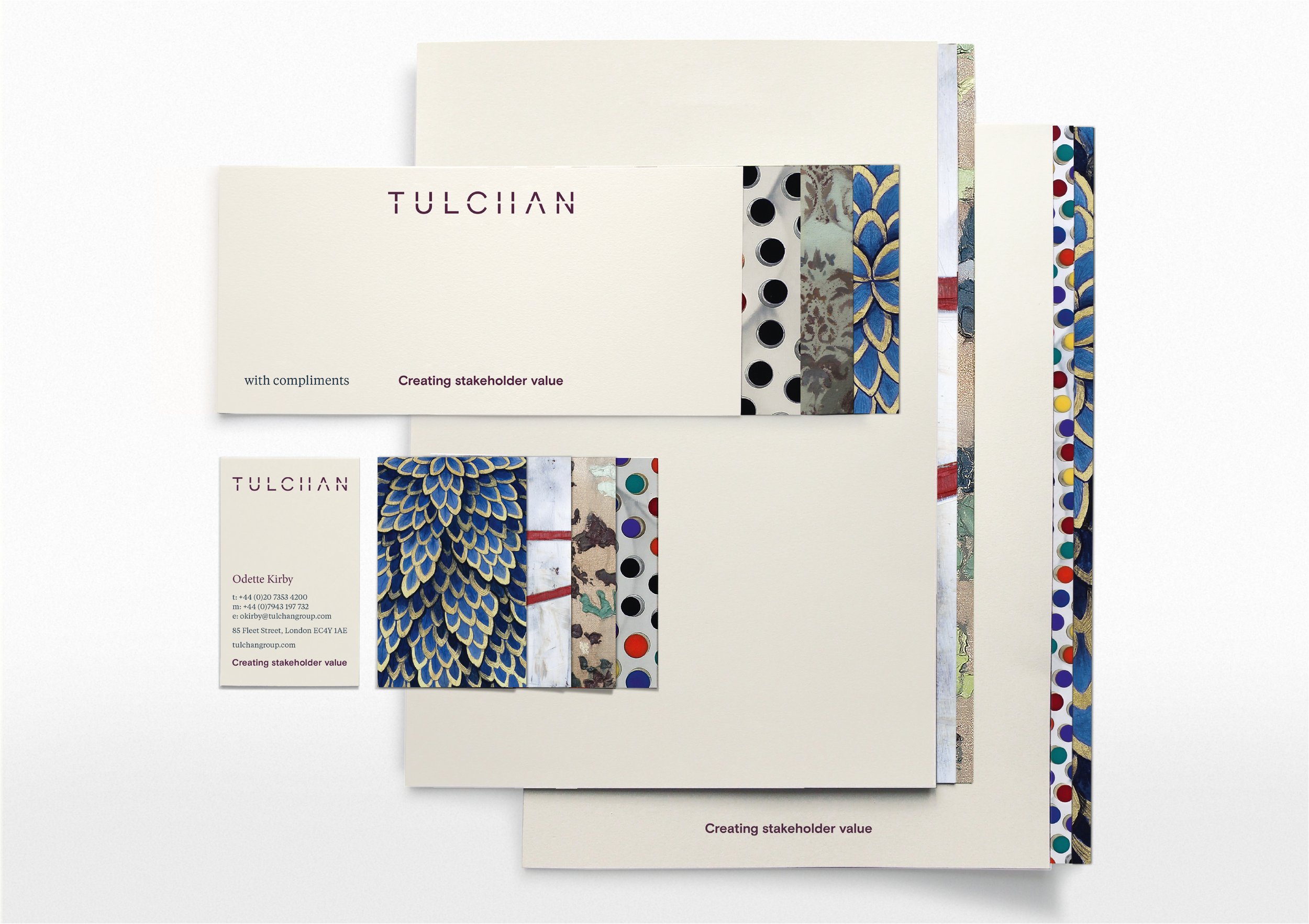
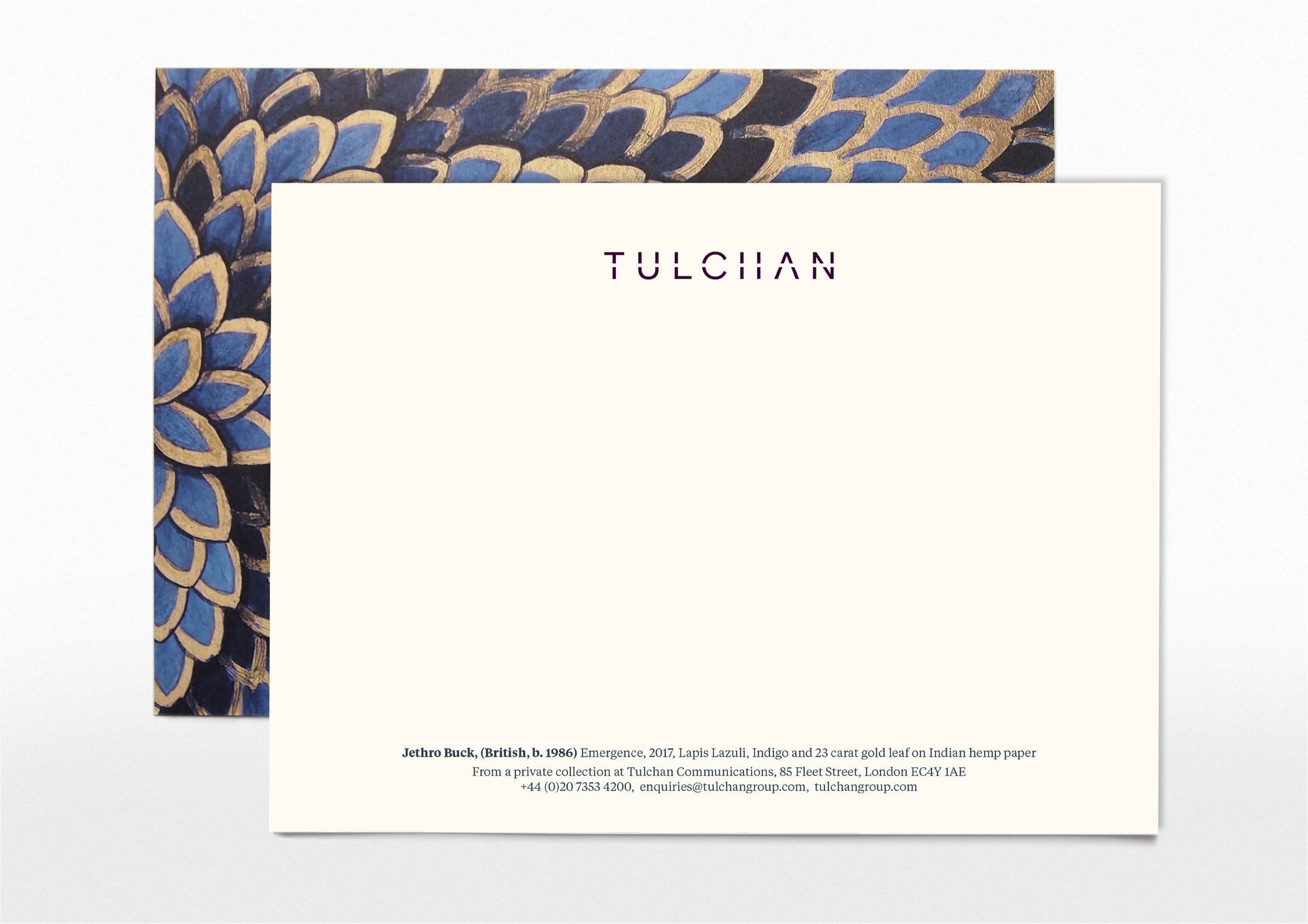
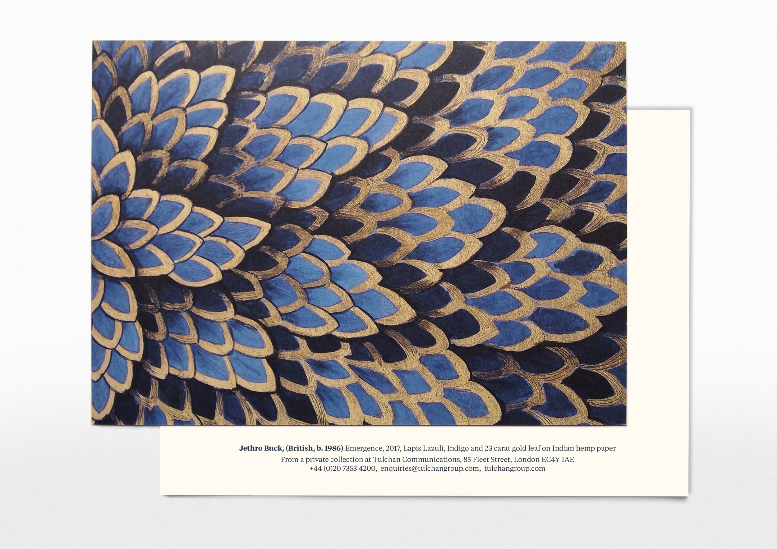
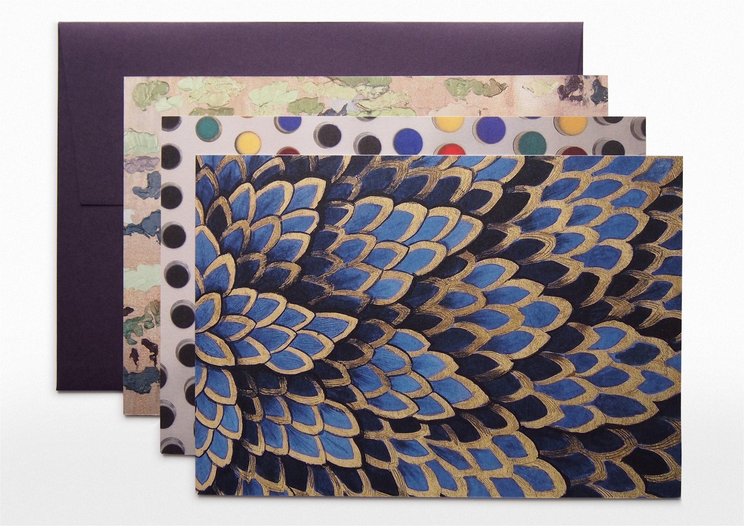
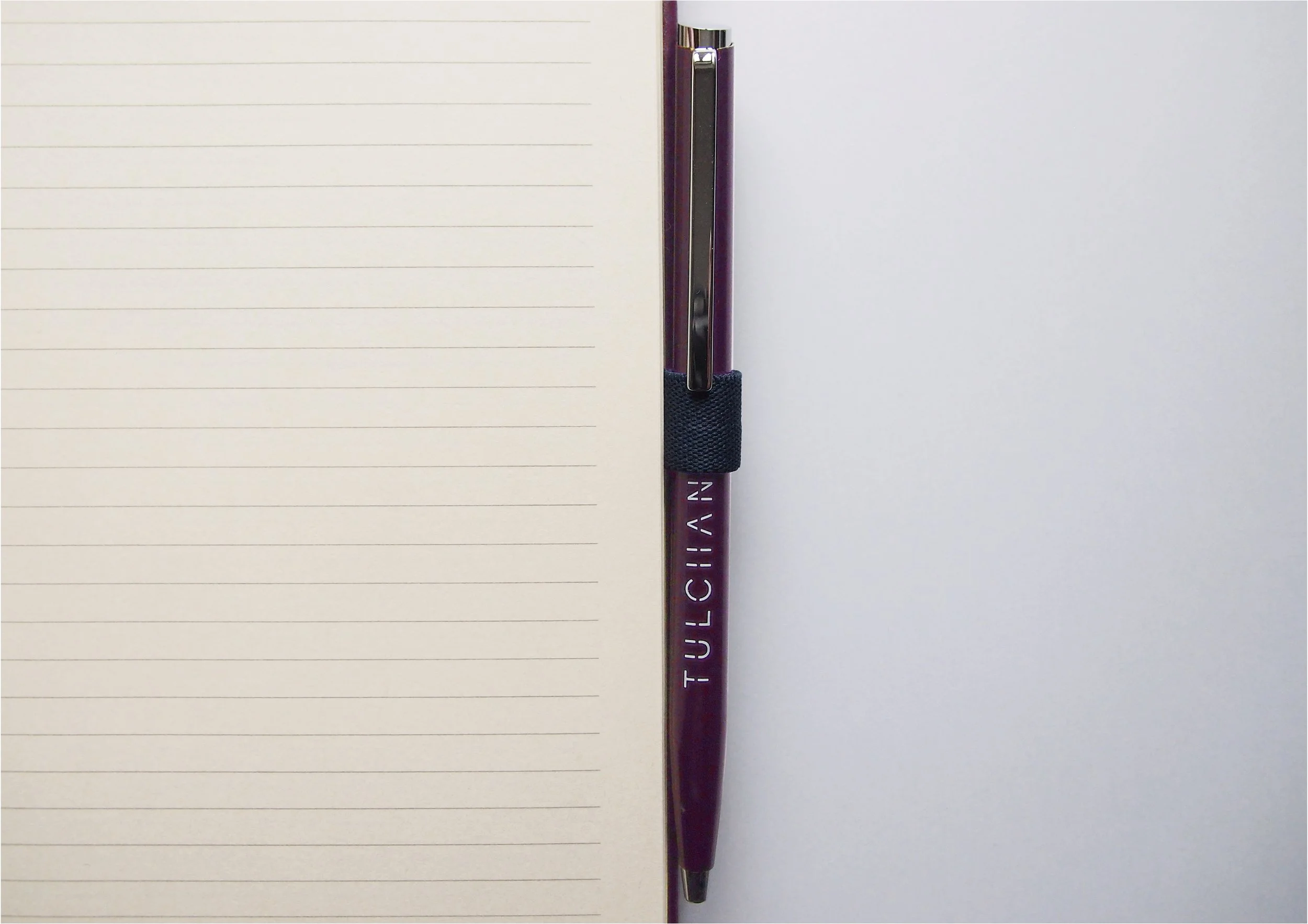
Design for print. Producing a new range of corporate stationery – the challenges behind the production. One for the print nerds.
Tulchan was a privately owned, medium sized strategic financial and corporate advisory firm with offices in London and Singapore (in January 2023 it was purchased by CVC Group and merged with it’s US PR firm Teneo. It’s was one of the top advisory firms in the country with a portfolio of FTSE 100, FTSE 250 and privately owned companies and trade bodies.
Visually the firm was keen to lean towards that of a creative boutique agency – portraying the team as friendly, approachable, creative thinking experts, as opposed to their competitors who were generally portrayed with a slightly ‘colder’ corporate appearance.
My client
Background
You can read the full story about re-branding Tulchan Managing the delivery of all brand assets for Tulchan Communications when a new company strategy meant a new brand identity.
I show this case study as it is the most recent story to tell, but I have been involved in the production of corporate stationery many times. Each company has its own challenges and solutions.
My role
I was responsible for taking the top-level design solution crafted by Jon and S-T Design (see rebranding story mentioned above) and delivery all print and digital assets.
Challenges and solutions
Challenge: Limited storage space, multiple assets to produce.
Solution: Print whatever ever we can digitally – shorter print runsChallenge: The old Conqueror paper stock wasn’t suitable for digitally printing, and at the time at least there were supply issues from a paper mill closure.
Solution: Mohawk Superfine Ultrawhite Eggshell was an excellent choice. It honour the look and feel of the original Conqueror stock: off-white, heavy weight, natural texture, was suitable for digital print and came with 3 different sized envelopes.Challenge: The Tulchan look and feel is that of a creative, boutique, high-end agency, just using off-white paper stock is not enough
Solution: GF Smith Colorplan Amythest, plum was a brilliant match for Tulchan’s dark purple brand colour. A Copper Foil used lightly gave a correct nod to luxuryChallenge: Great printers that have high sustainability credentials partly due to Tulchan’s recent B-Corp accreditation
Solution: Pure PrintChallenge: Not everything could be digitally printed, the presentation covers, folders and tabbed dividers had to printed on board. And I hit a problem printing the Plum colour: Pantone 518C as a special on this uncoated board. As digital print is CMYK, when I printed the spot colour on the uncoated board the match was awful… it did not look like a cohesive suite of stationery.
Solution: I worked with the printers to create wet proofs of a range of CMYK swatches printed on to the board stock and then chose the best match. The printer I worked with to do this sadly went bust, which is when I went to Pureprint. The end result was great.
