Benchmarking study for Fly UX
Diploma coursework
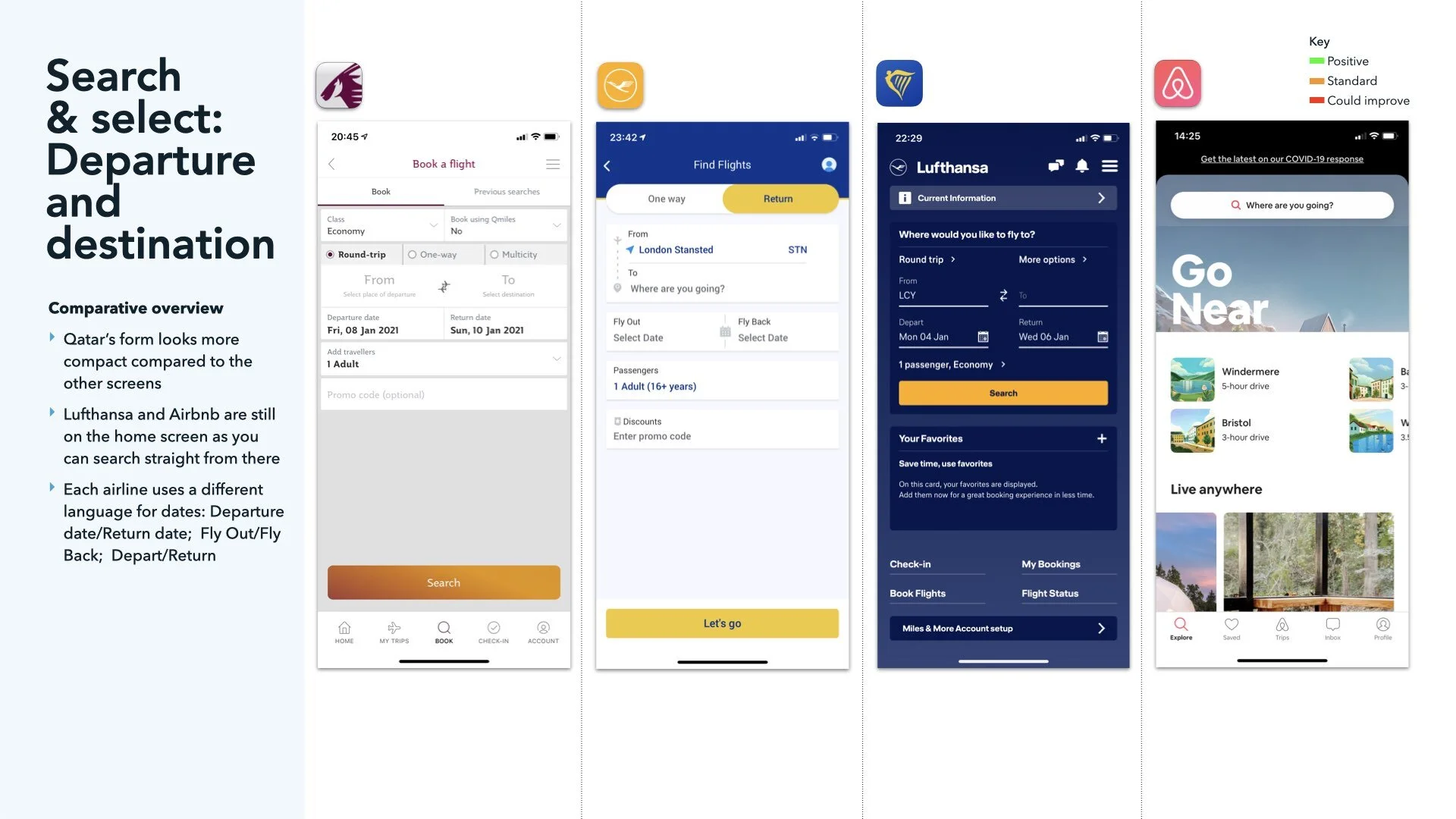
I studied 4 x apps, using an iPhone 11. IO 14.3. Latest versions as of 11 Jan 2021
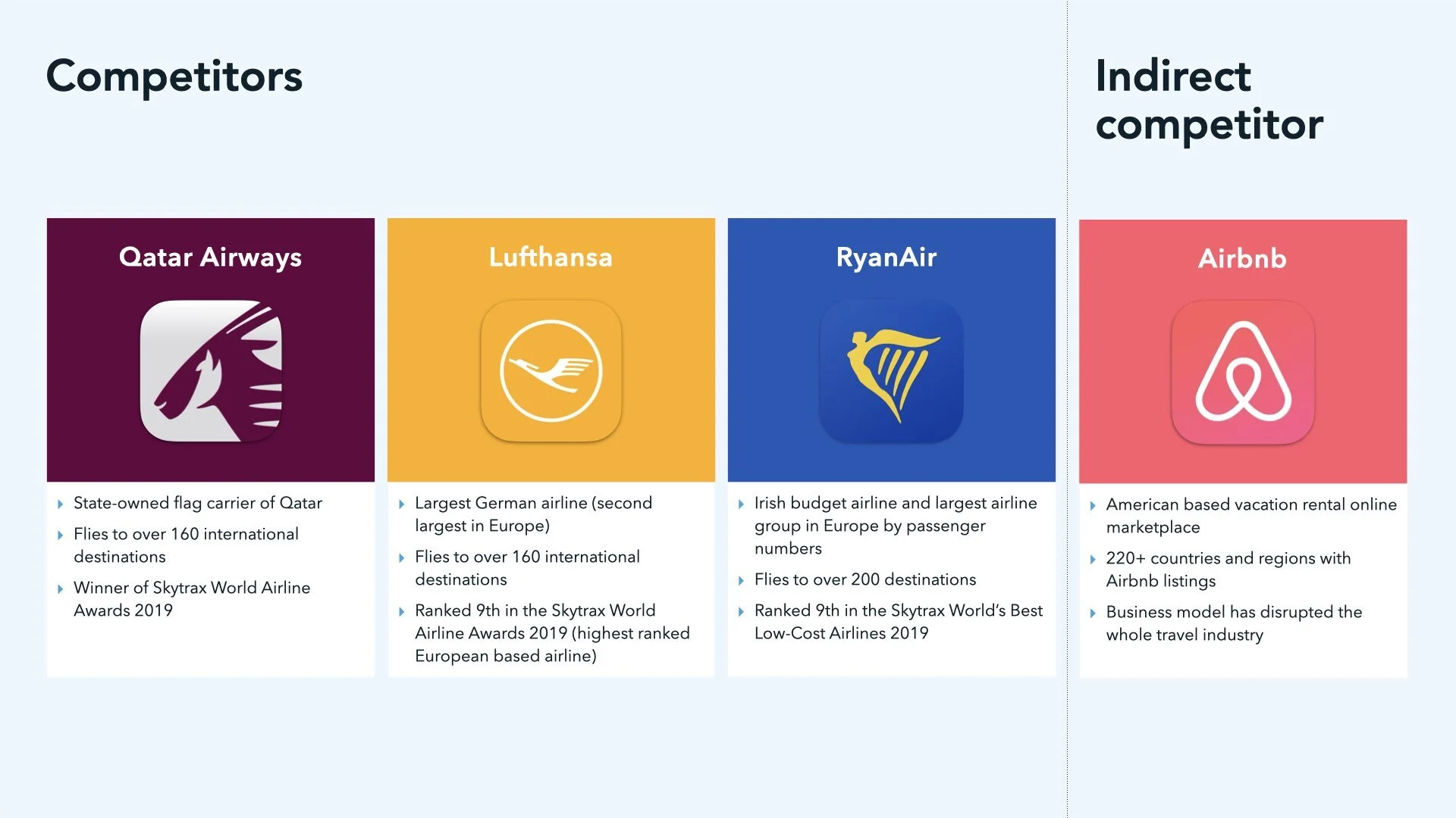
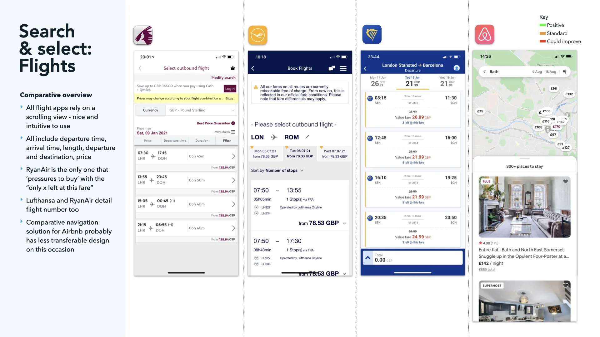
I chose to study: Qatar Airways – Winner of Skytrax Airline Awards 2019; Lufthansa – Skytrax Highest ranked European Airline; RyanAir – Skytrax World’s Best Low-cost Airline; Airbnb – indirect competitor with a disruptive business model that has changed the way the world does holidays
I enjoyed the comparative process and a was great way to get ones head into the ‘space’ of the new product.
Drawing a comparison between how I would start a graphic design project vs a UX project, it’s a pretty similar beginning - research what the competitors do, we just used to do it without the heuristic evaluation.
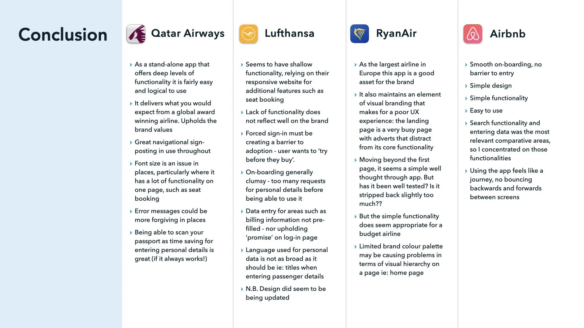
SOME KEY TAKEAWAYS FROM THE RESULTS
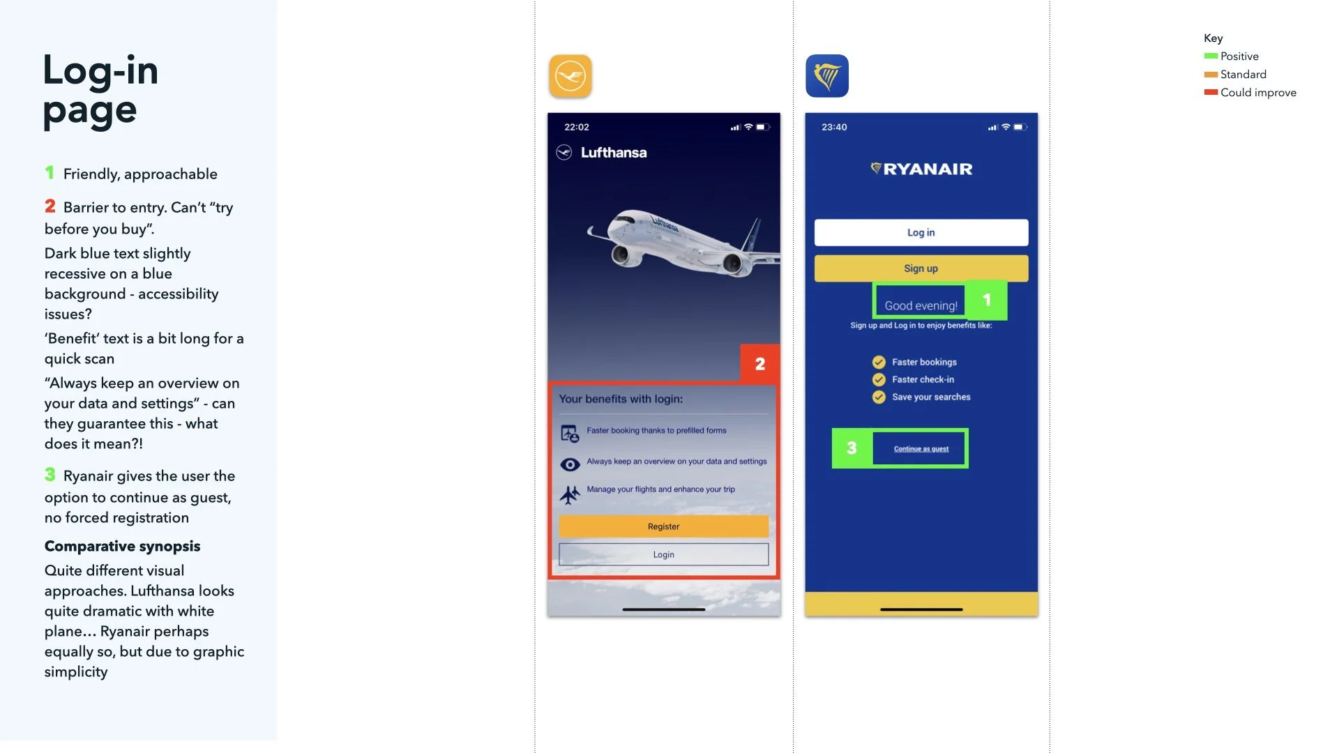
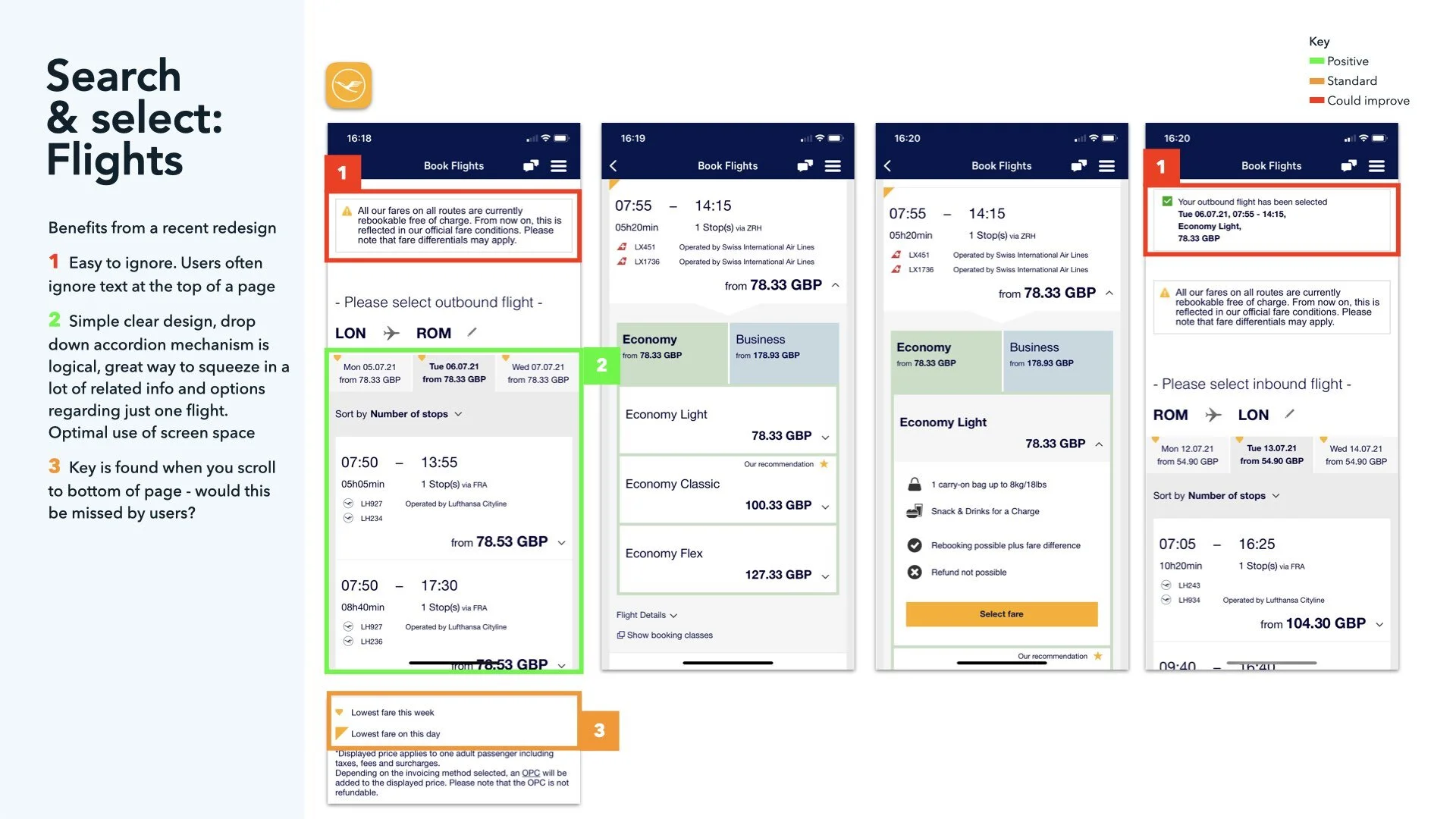
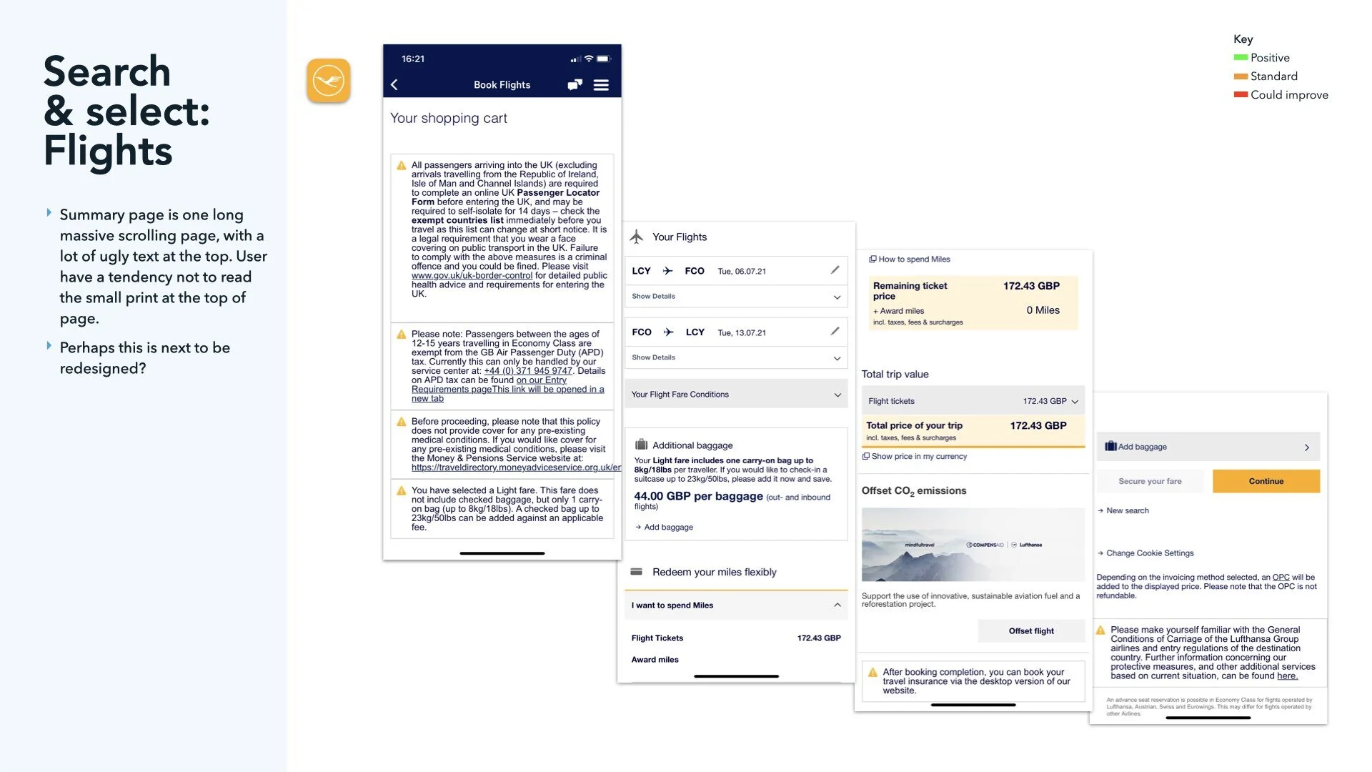
Creating a barrier to entry for the app - forcing users to register / log in such as with Lufthansa - I assume must be loosing users. I going to guess that some users search on a whim - they want immediacy. Offering the option to carry on without registering / logging in is good
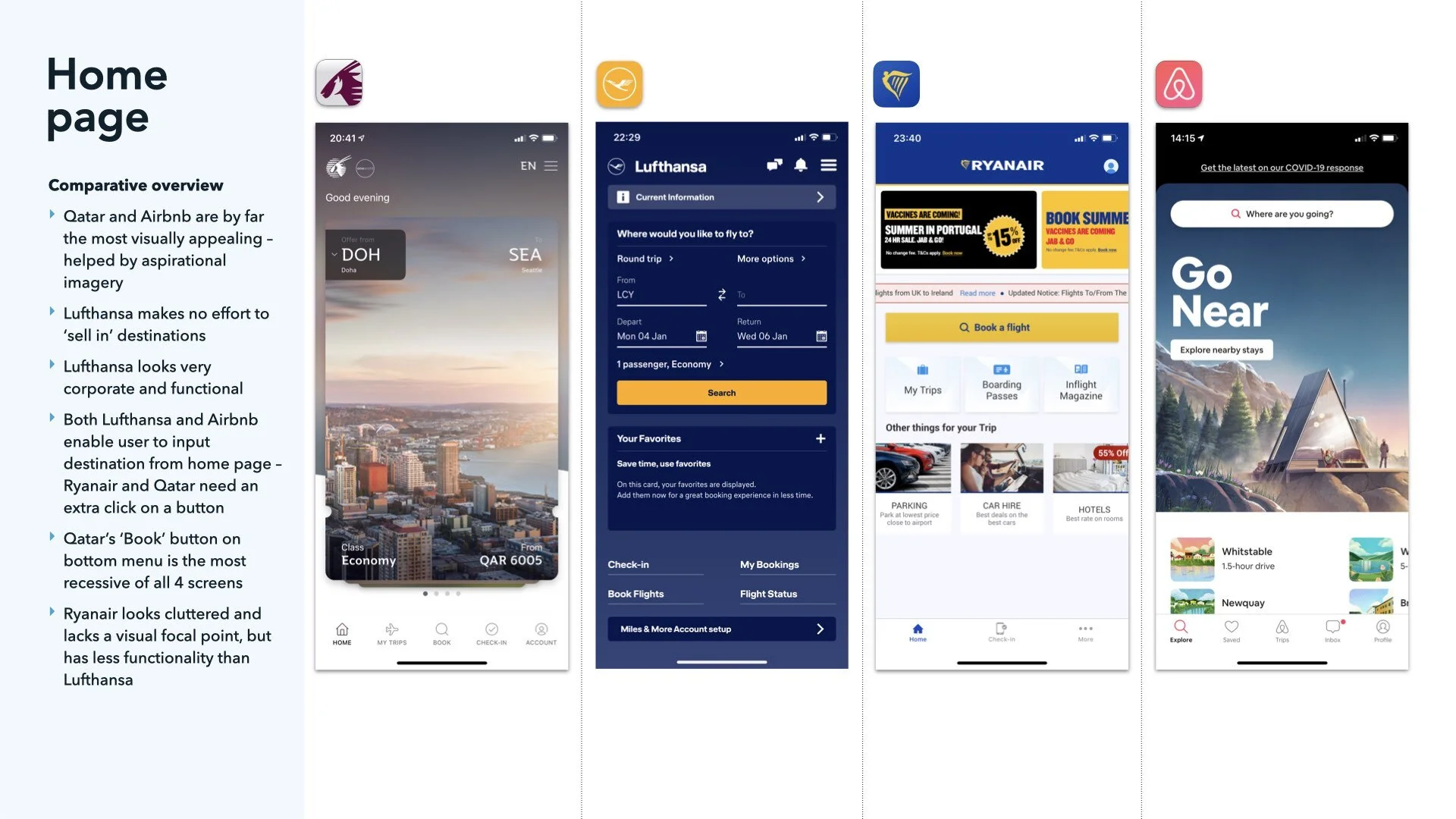
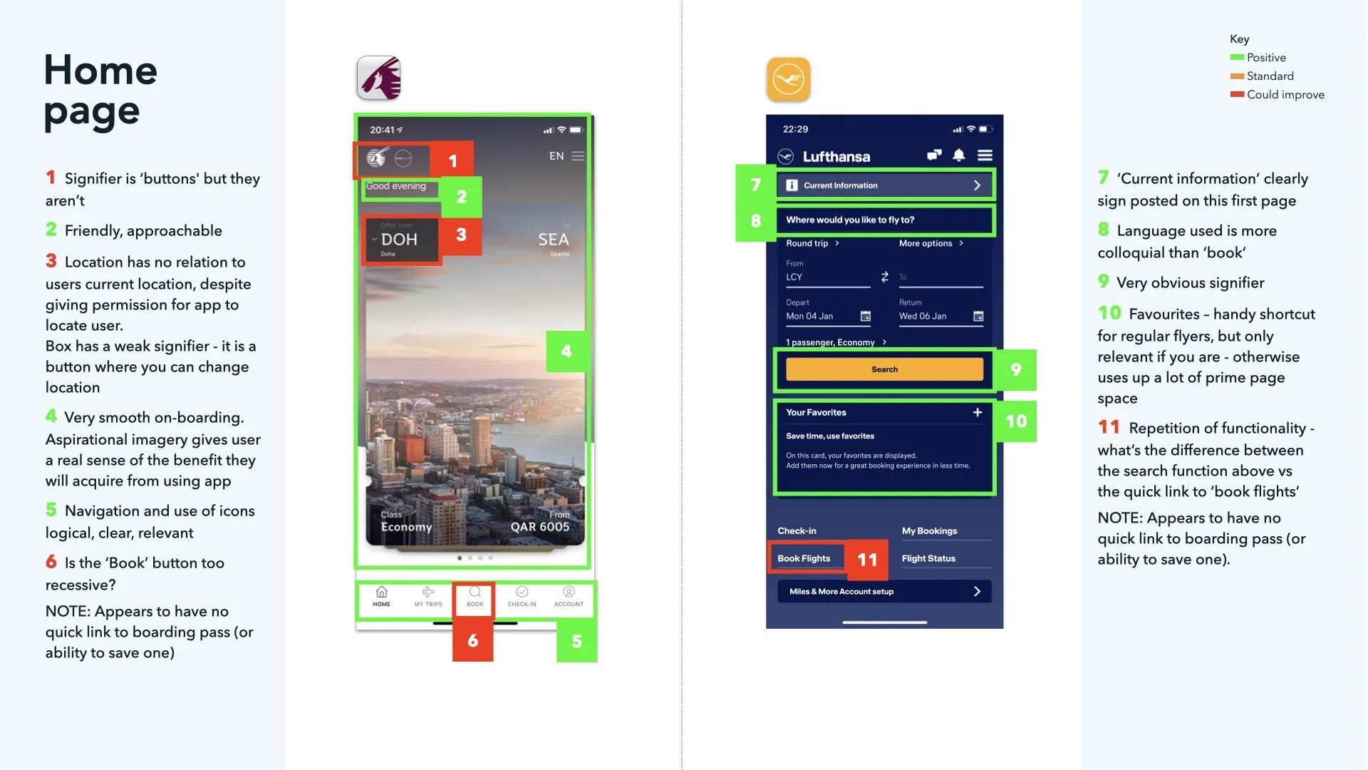
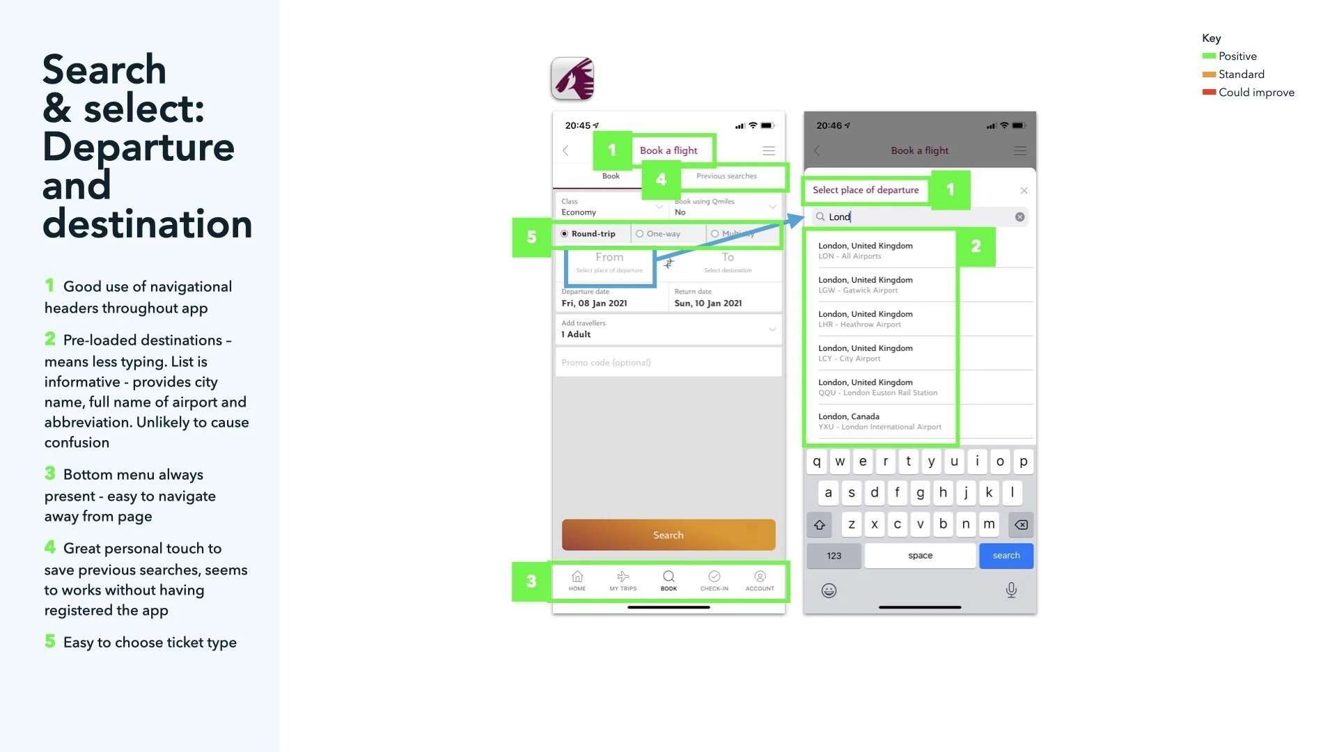
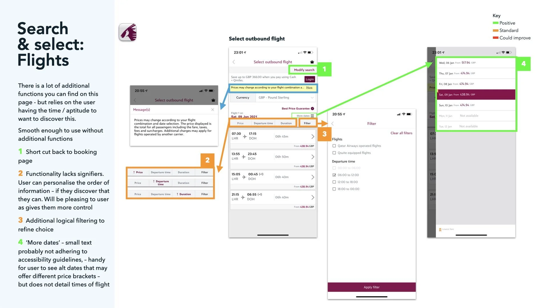
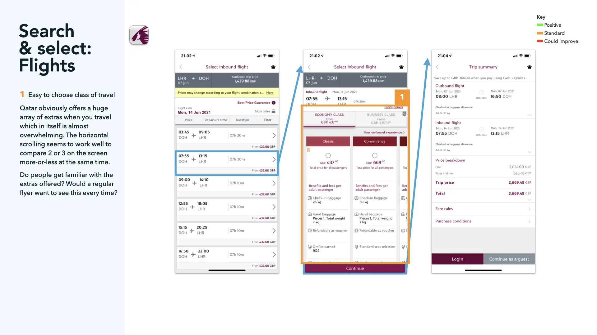
Qatar Airways was generally quite pleasing to use with a lot of functionality, but text was too small in places. I question if all the functionality is needed - but certainly does it all need to go on one screen?
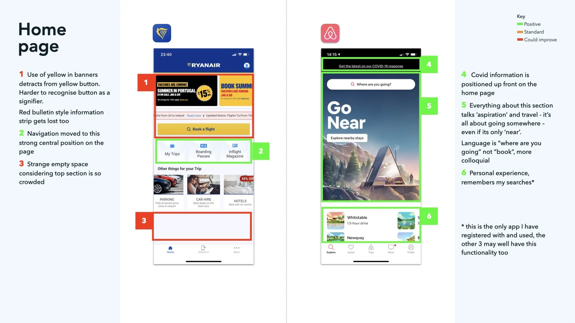
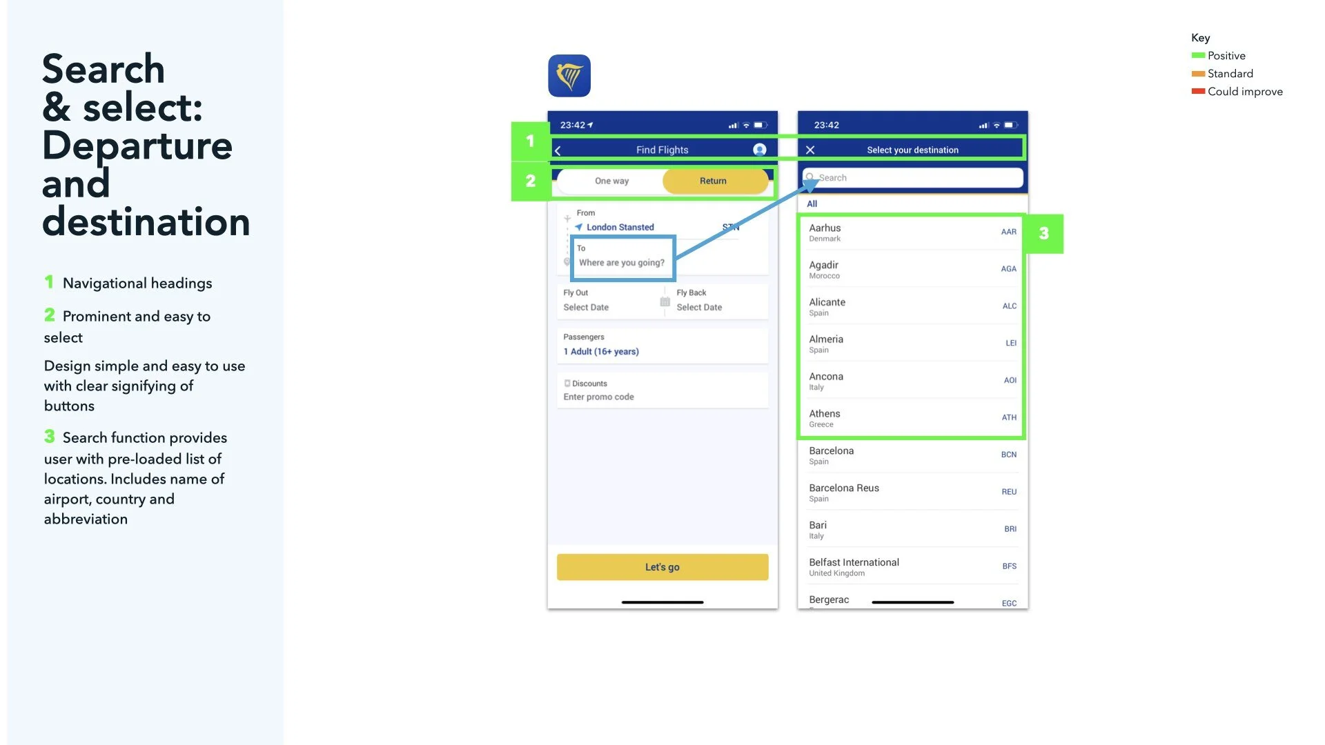
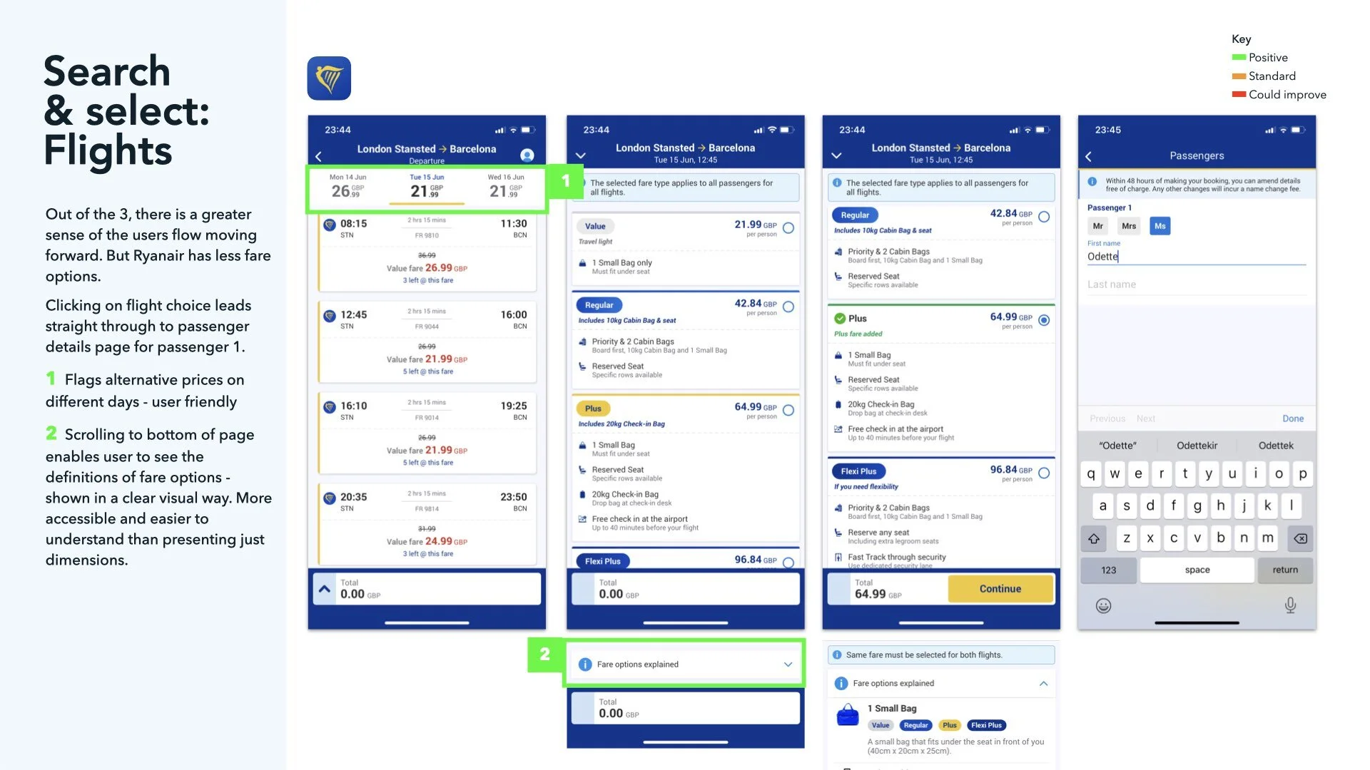
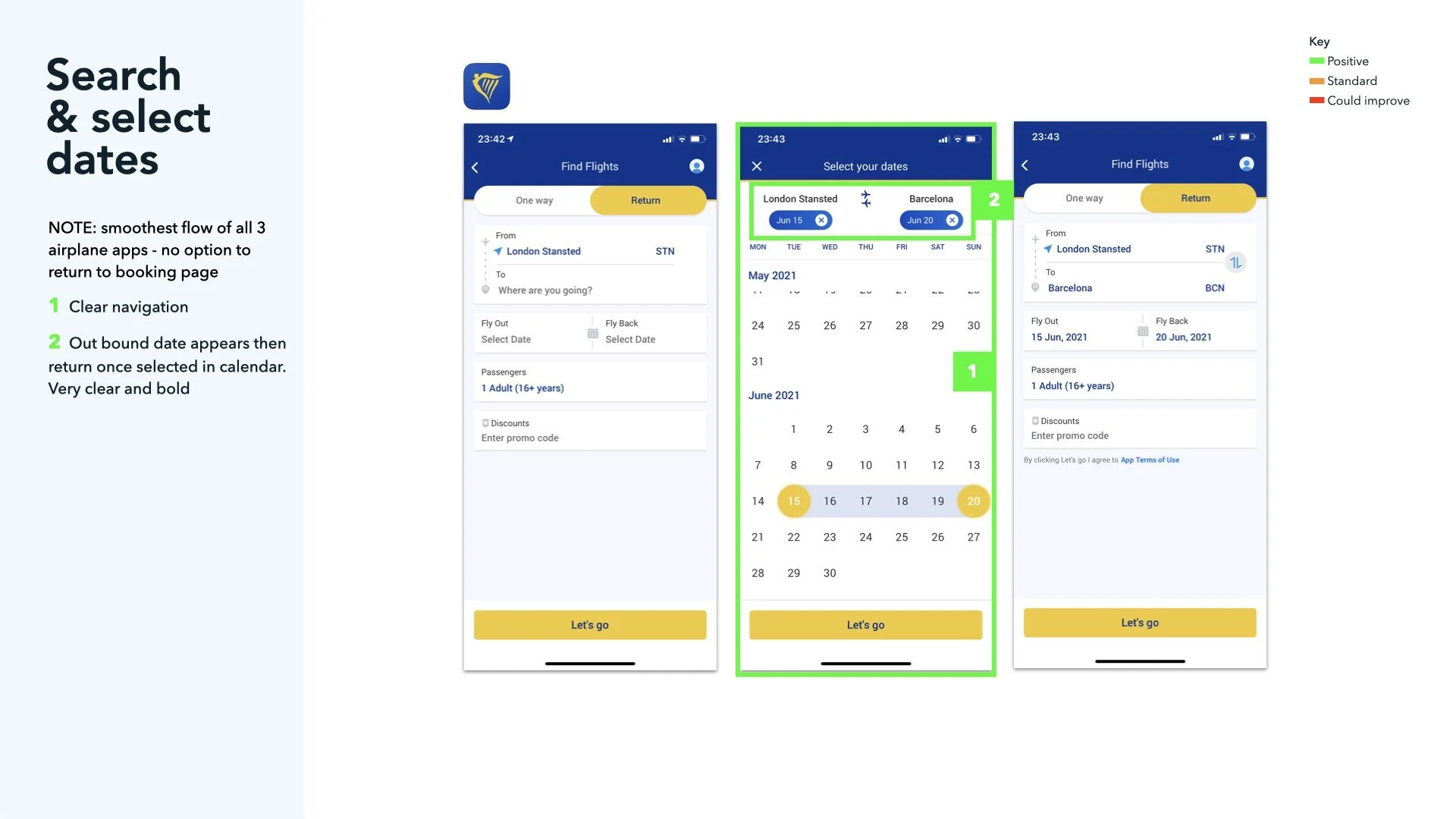
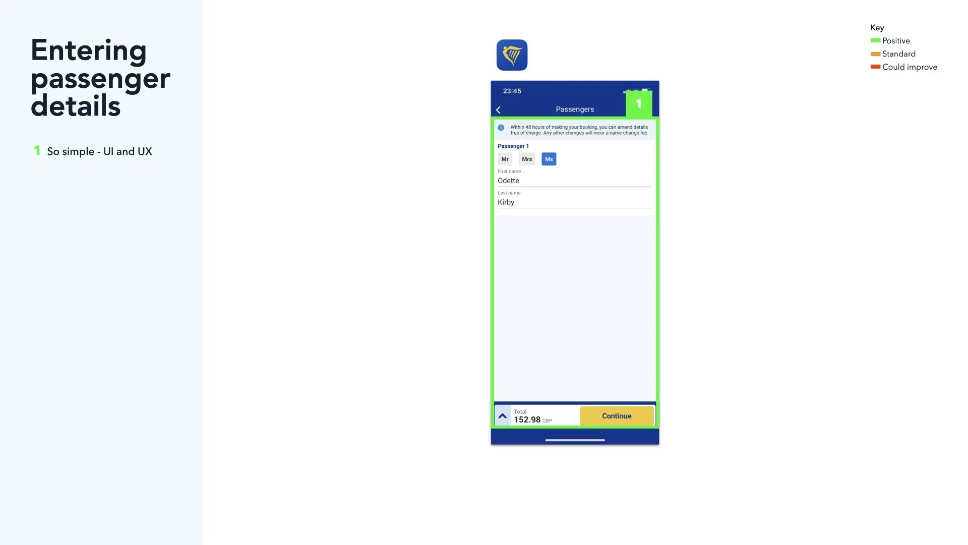
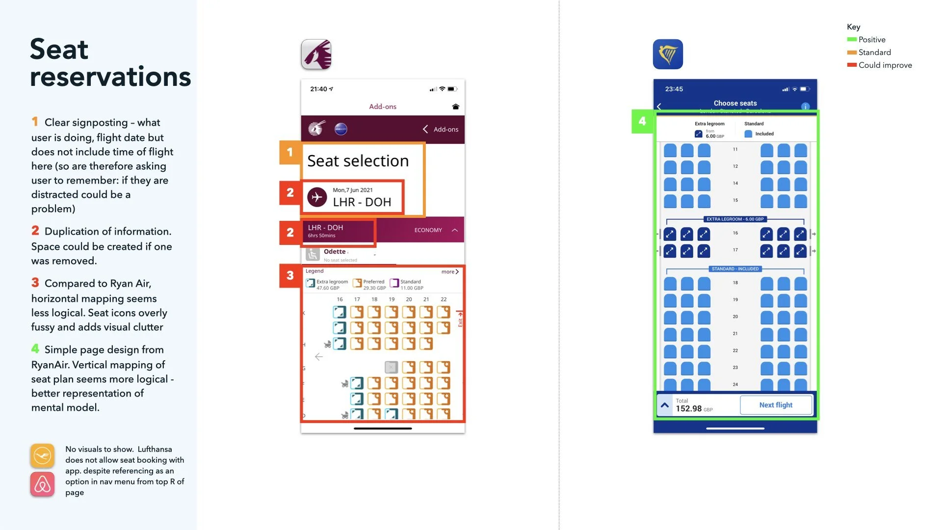
Simple page designs like RyanAir feel clearer and easier to use - less overwhelming, but using a really limited colour palette may cause problems with information hierarchy
Adverts are bad and get in the way of key user information
It’s nice when the software is friendly: “Good evening!”
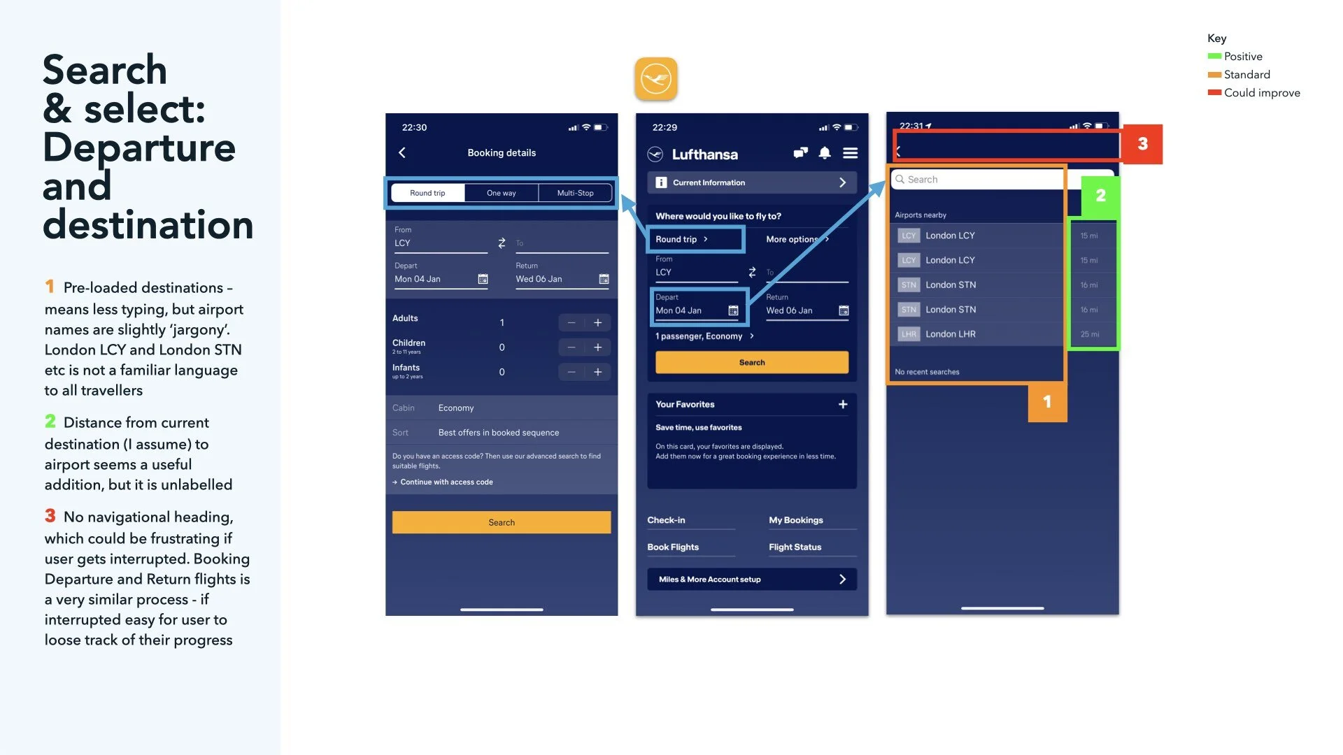
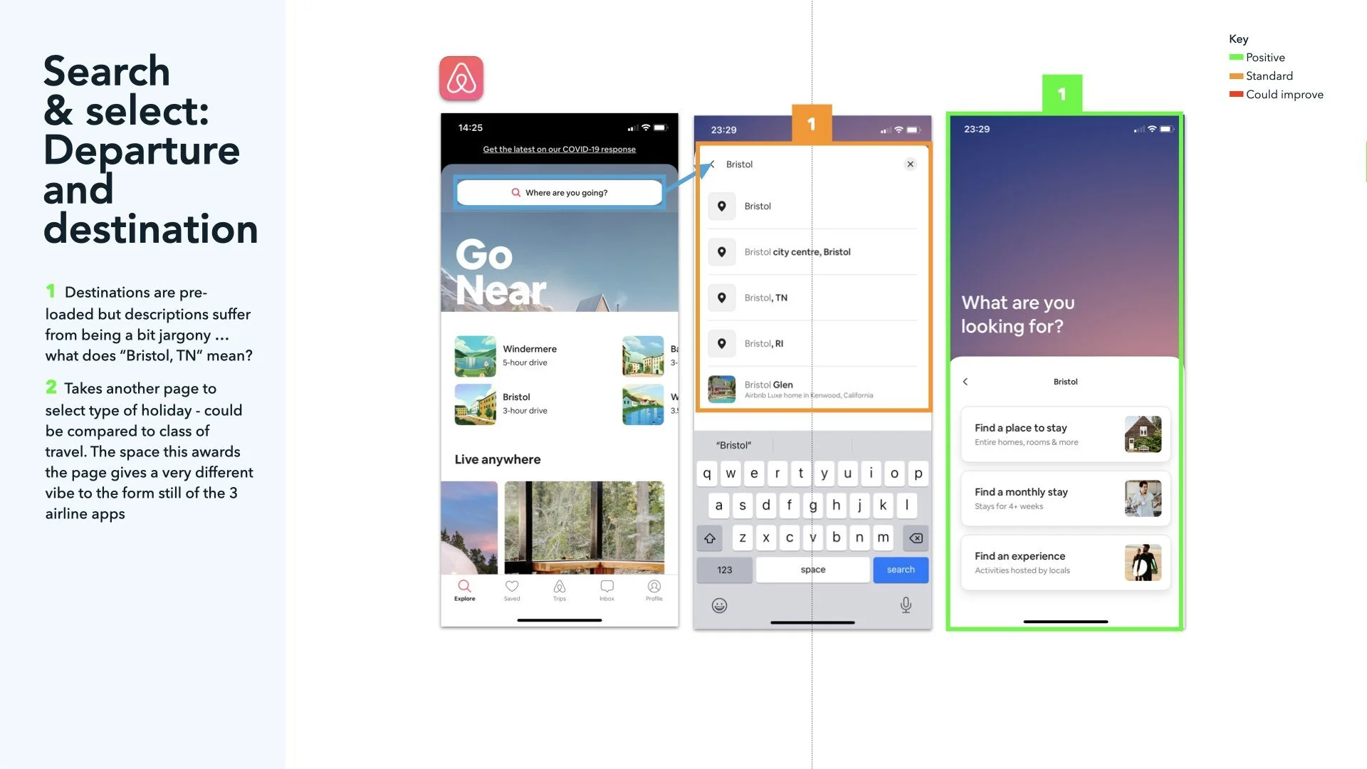
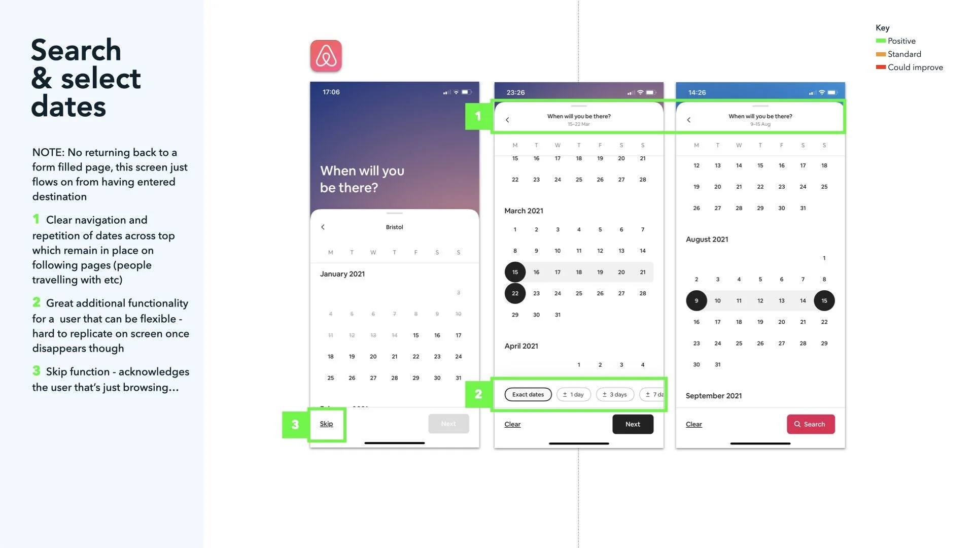
Reducing the need to type much really helps the experience - provide pre-loaded lists to tap for locations
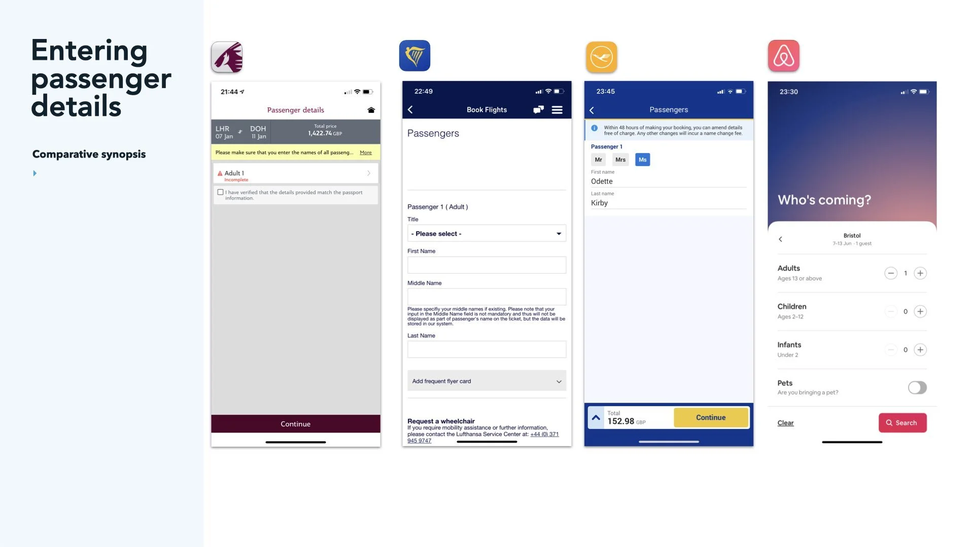
Asking too many personal question up-front before searching for a flight seemed wrong and lost the momentum / excitement of looking
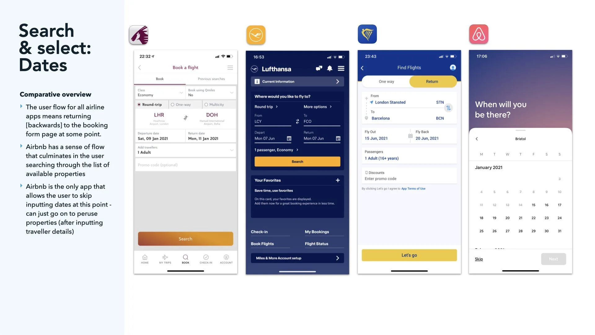
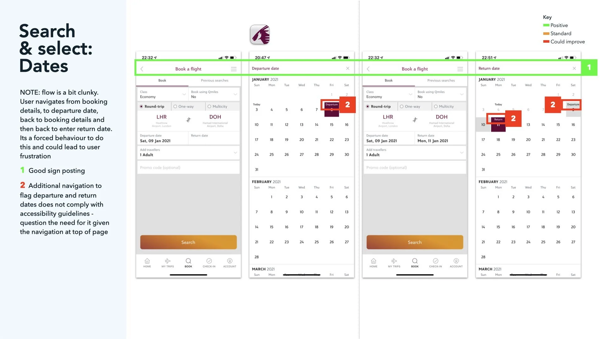
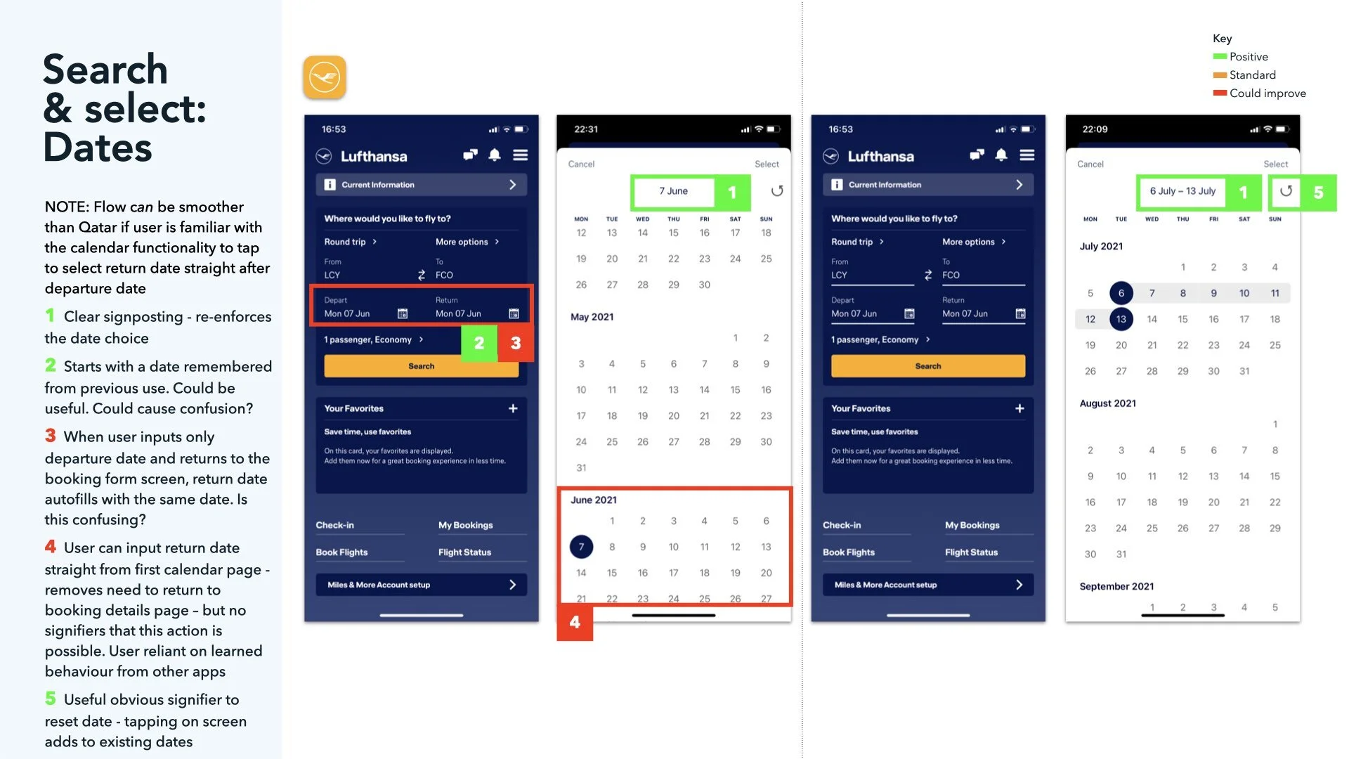
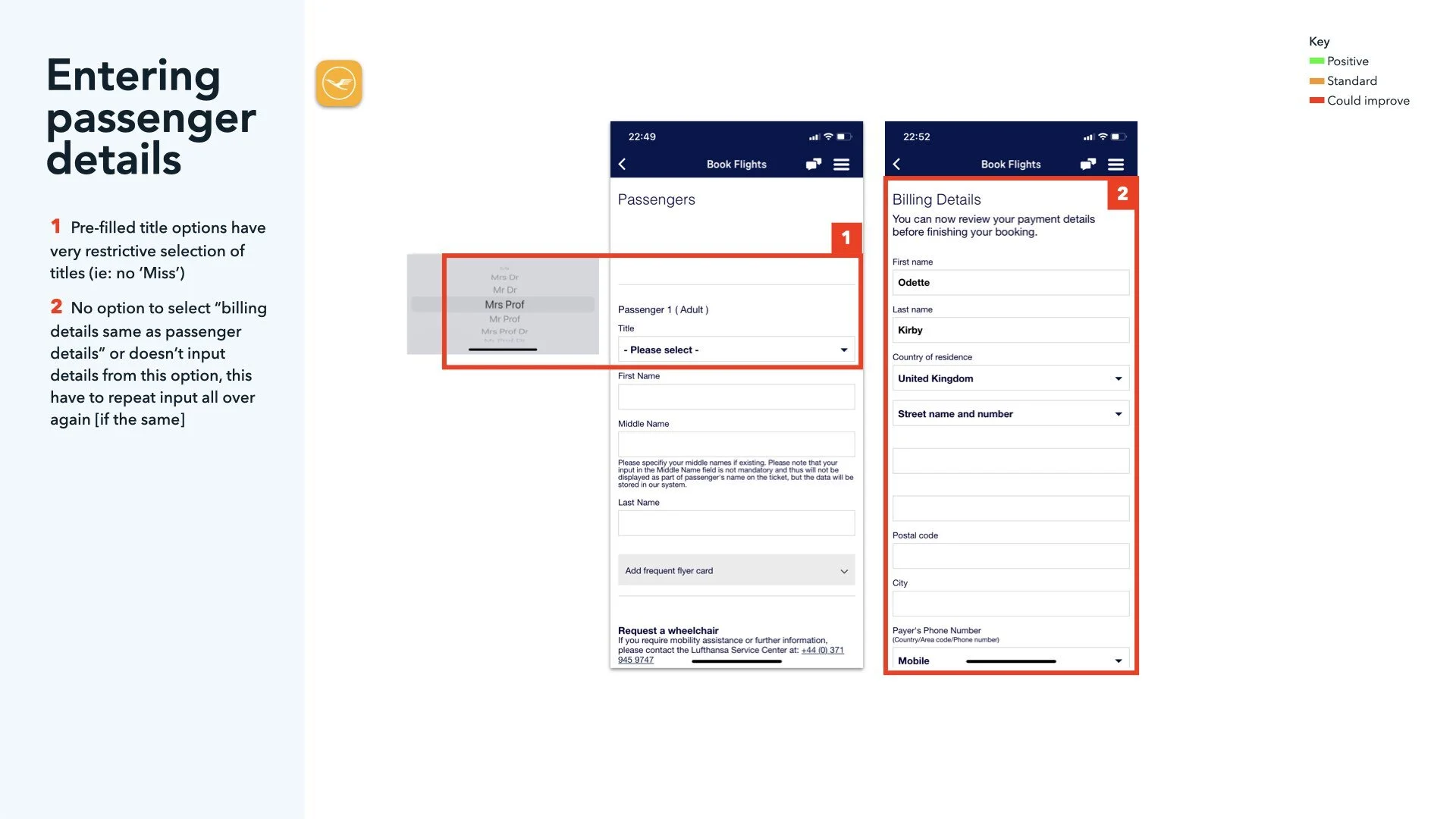
Qatar Airways and Lufthansa both used a similar form filling technique - having one central page to fill in details - using a pop-out state to do this and then returning to the form. This feels cumbersome. No sense of forward momentum
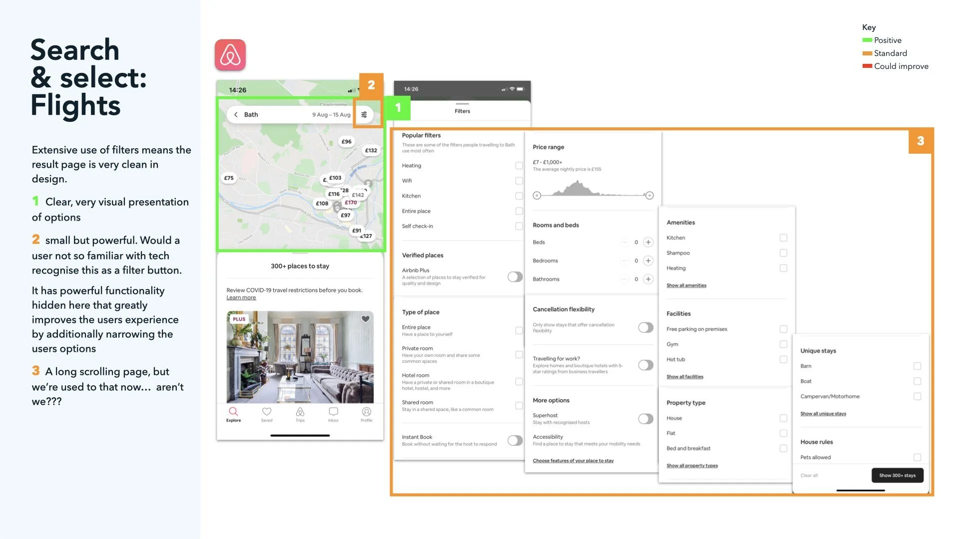
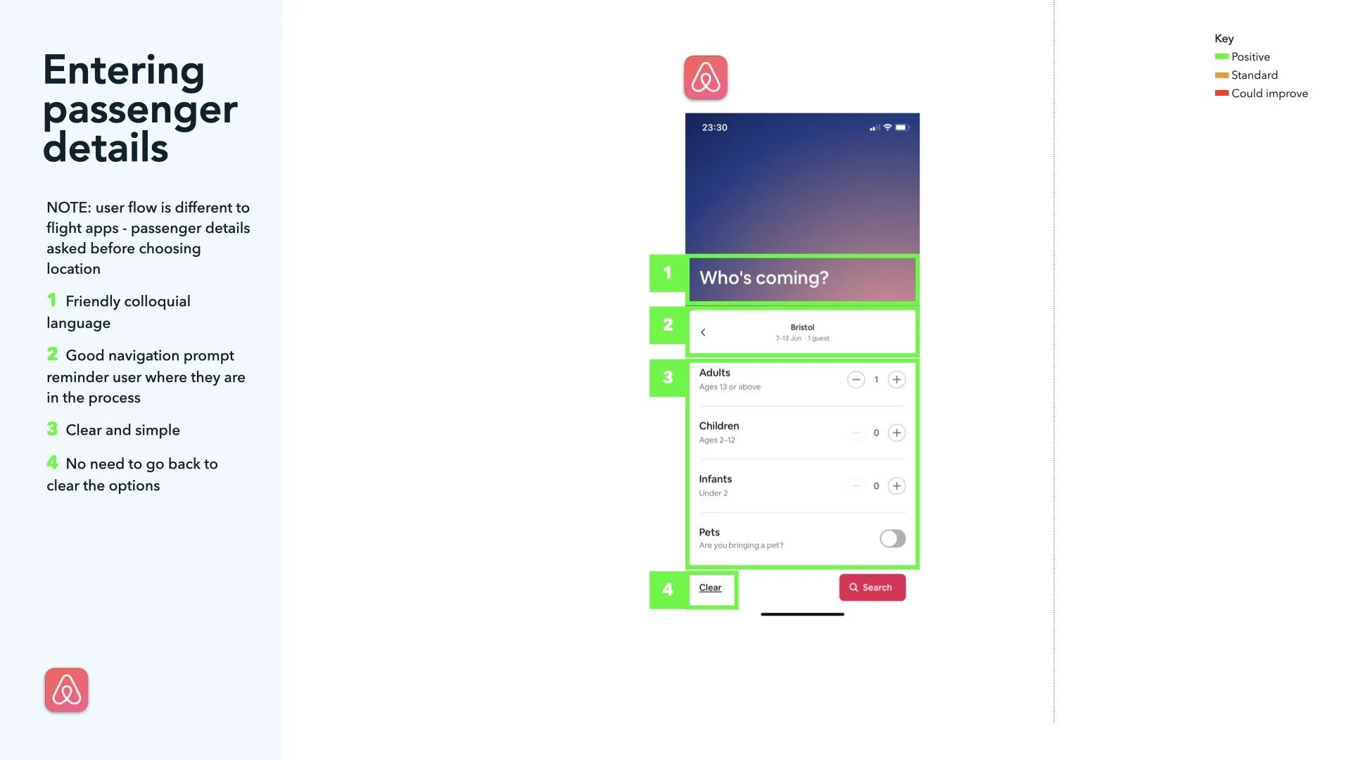
Airbnb felt more like a journey through the App, and not just a bunch of forms to fill in.
Aspirational imagery is nice to see and could add to the sense of excitement
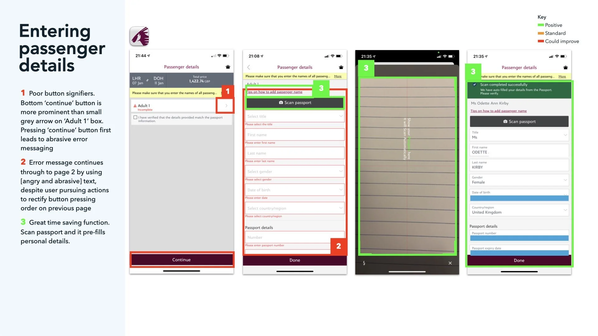
Forms need to be forgiving (forgive mistakes quickly), remember (previous searches) and use smart data wherever possible (personal information, location etc.)
Being able to scan the passport to avoid filling in more forms was great (I guess if it works!)
