
Making sense of UX research data

Photo by Hugo Rocha on Unsplash
I wanted to spend a little more time re-reading how to process the data collected, as it’s an area I have little experience of, but am fascinated by the challenge.
Having collected loads of research data, making sure it’s all well recorded, organised and backed up, one needs to analyse it. You need to:
“Review notes
Look for interesting behaviours, emotions, actions and verbatim quotes
Group the notes on a whiteboard (get the whole team involved to speed the process up and reduce the bias)
Watch the patterns emerge
Rearrange the notes as one continues to assess the patterns”
From Just Enough Research by Erica Hall
The end result is an Affinity diagram. Erica Hall talks about extracting design mandates from this process, defining insights, and categorising the post-it note observations under those categories.
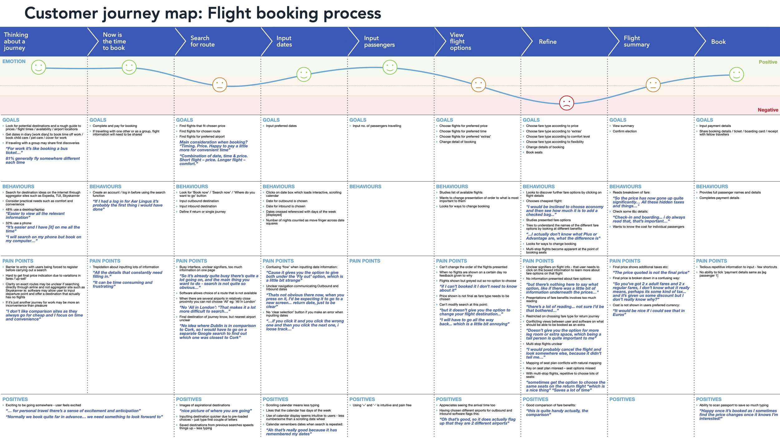
My customer journey map for Fly Ux
On the UX course I did, we progressed from the affinity diagram to plotting a Customers journey map. This did feel like a logical progression, although as I keep reading I guess it all depends on the project.
To produce the journey map, you divide the journey a user takes to reach their goal into logical sections, and then plot their Goals, Behaviours, Emotions, Pain Points and Context. Verbatim quotes here-and-there can be powerful. Based on the balance of the observations recorded, you then plot the level of emotion experienced by the user using colour coded smilies (if you like!), with emotions being positive, neutral of negative. I would say this could definitely by weighted by personal bias but as with so much of the data analysis in UX, if it’s produced with input from multiple individuals, the bias should be reduced.
Creating a persona is another way to process and present data – ensuring all the the team are on the same page and designing a product for the same user. Alan Cooper is famous for developing this technique and talks about it in his book “The inmates are running the asylum”. We weren’t encouraged to produce a persona for the Fly UX product - it may be something I try myself at some point for Fly UX, retrospectively (but we’ll see how I do for time)!
Benefits of a persona:
Intended to end '“feature debates”
Avoid self-referential design
Challenge assumptions
Introduce objective data
Provide a target for design team
Builds empathy
Helps teams avoid generalisations
Help teams get specific
Pitfalls:
Personas contain fictional elements. This could be seen as undermining the research. Best to keep fictional elements to a minimum
There can be a tendency to produce personas without research
Can be confused with marketing personas (Marketing personas focus on research to sell a product. Design personas focus on research to understand the goals (and pain points) of a user when using a product.
They can be time consuming to produce and maintain as you may need to update as more research sheds more light on users
They don’t always have the intended affect – that is to have empathy with the user. Usability tests are more powerful.
You might need a few personas to address all the different users. I think that might be where they are really handy. If you have a simple product and are focusing on one user, then perhaps Usability test are the best route.
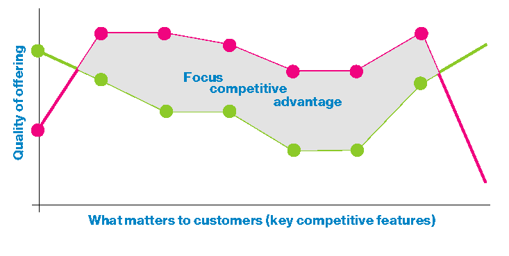
Customer value curve comes from a management book called Blue Ocean Strategy and is a competitive analysis tool.
It is:
A competitive analysis tool
From a customer perspective
Provides strategic direction
Help identify competitive gaps (to exploit the case)
Helps identify the differentiators

Empathy mapping is in some ways a similar process to an Affinity diagram, in that upi assess the research acquires and write is down on post-it notes but you place it on an map that vizualises what the user Says, Thinks, Feels, Does and ultimately her goals. These sections can obviously be tweaked if need be. It is ideally a group exercise. (Article from nng.com)
In her book Just Enough Research, Erica Hall also talks about a method of documenting research I’m boldly going to call Mental Modal Diagramming. She says there are 2 types of mental models: the one where we hold information in our head to make sense of the world, and the other where designers sketch/digram to better that world. To do this:
Take your user research
Make an affinity diagram
Take the affinity clusters and place in stacks representing the users’s cignitive space to create the model - the groups being based on their actions, beliefs and feelings.
Group the stack around the tasks or goals they relate to
She then suggests you could then go on to do Conceptual modeling/site mapping or Gap analysis.
Erica Hall then talks about Task Analysis/Workflow where you map each step the user undertook to complete a task. I think this might on occasions get called a Task Flow diagram…? Article here from nng.com