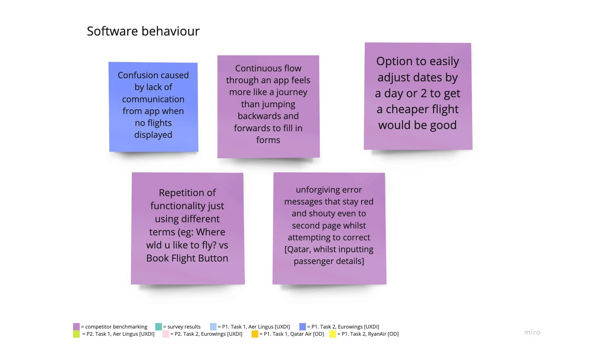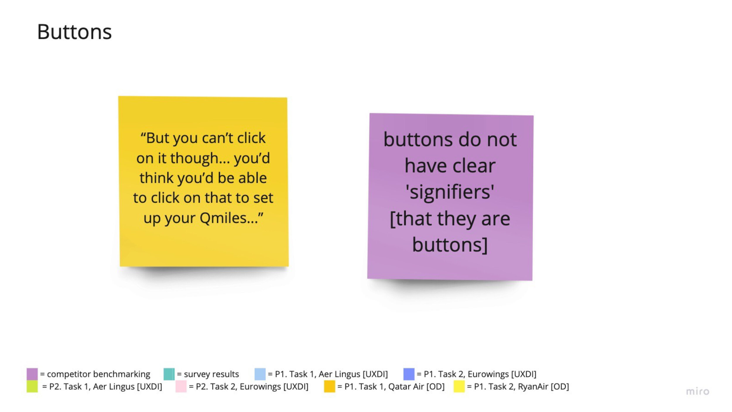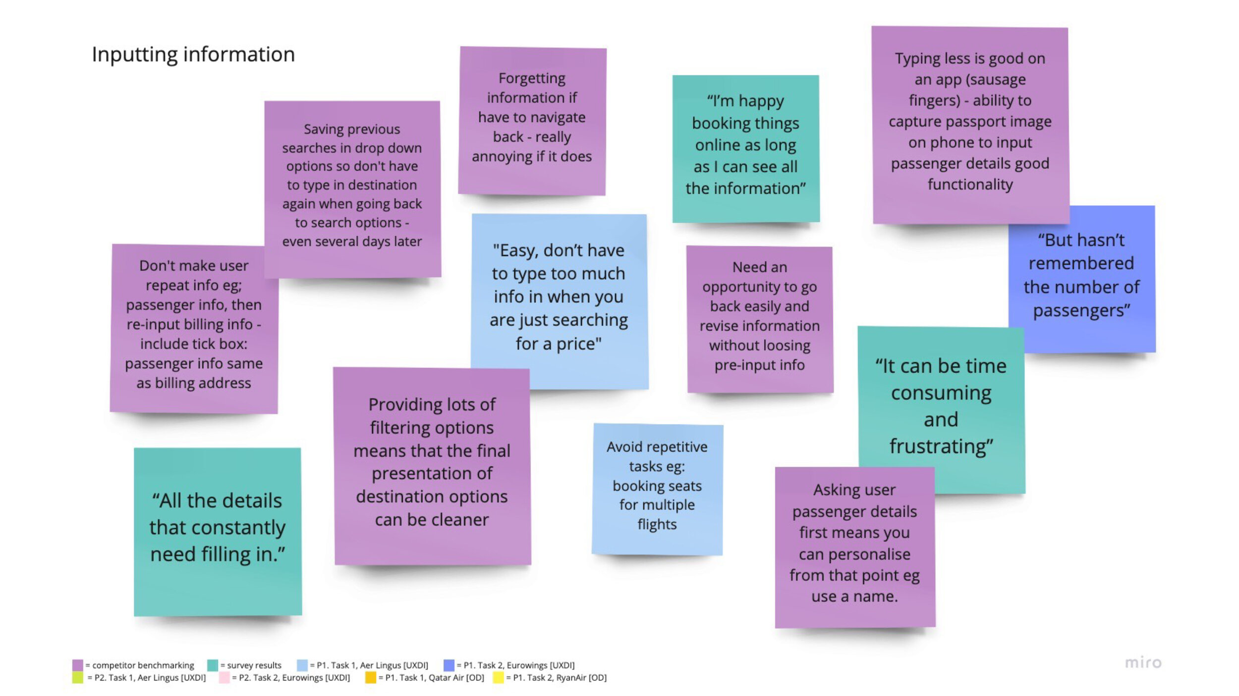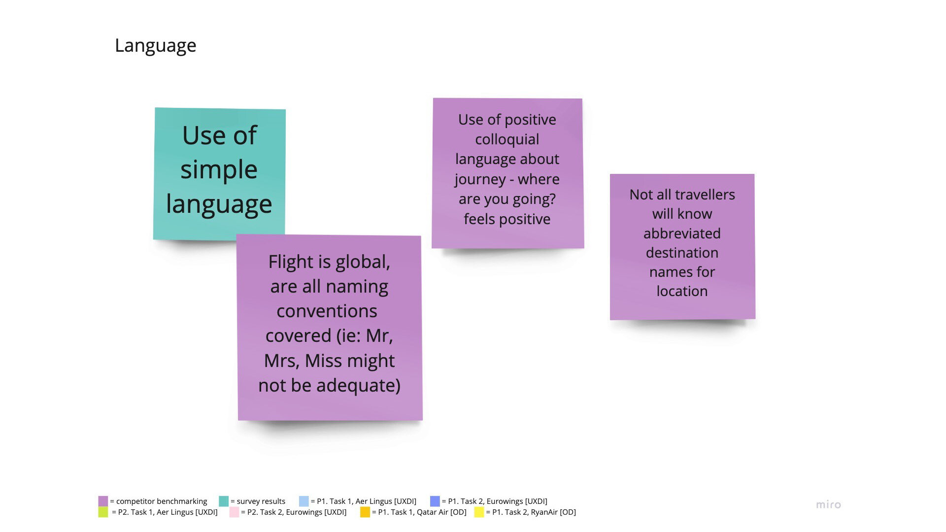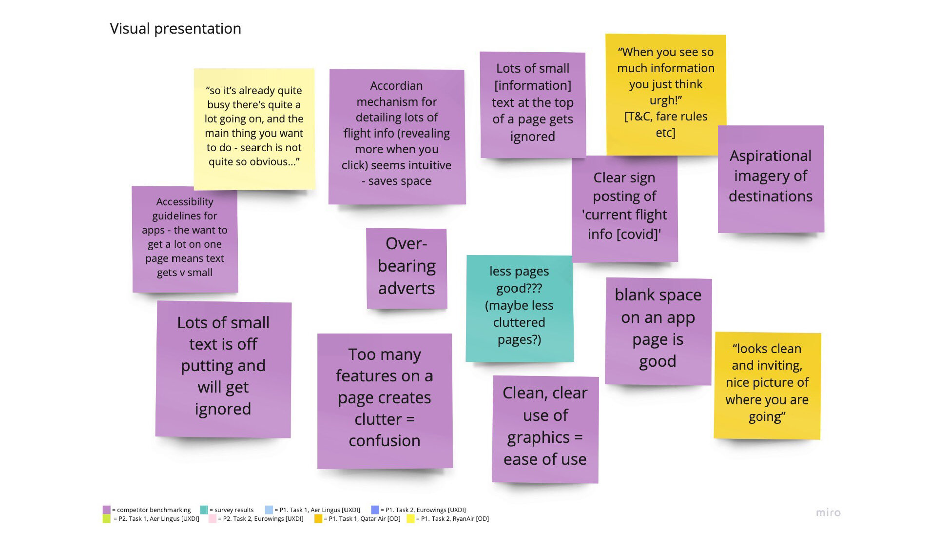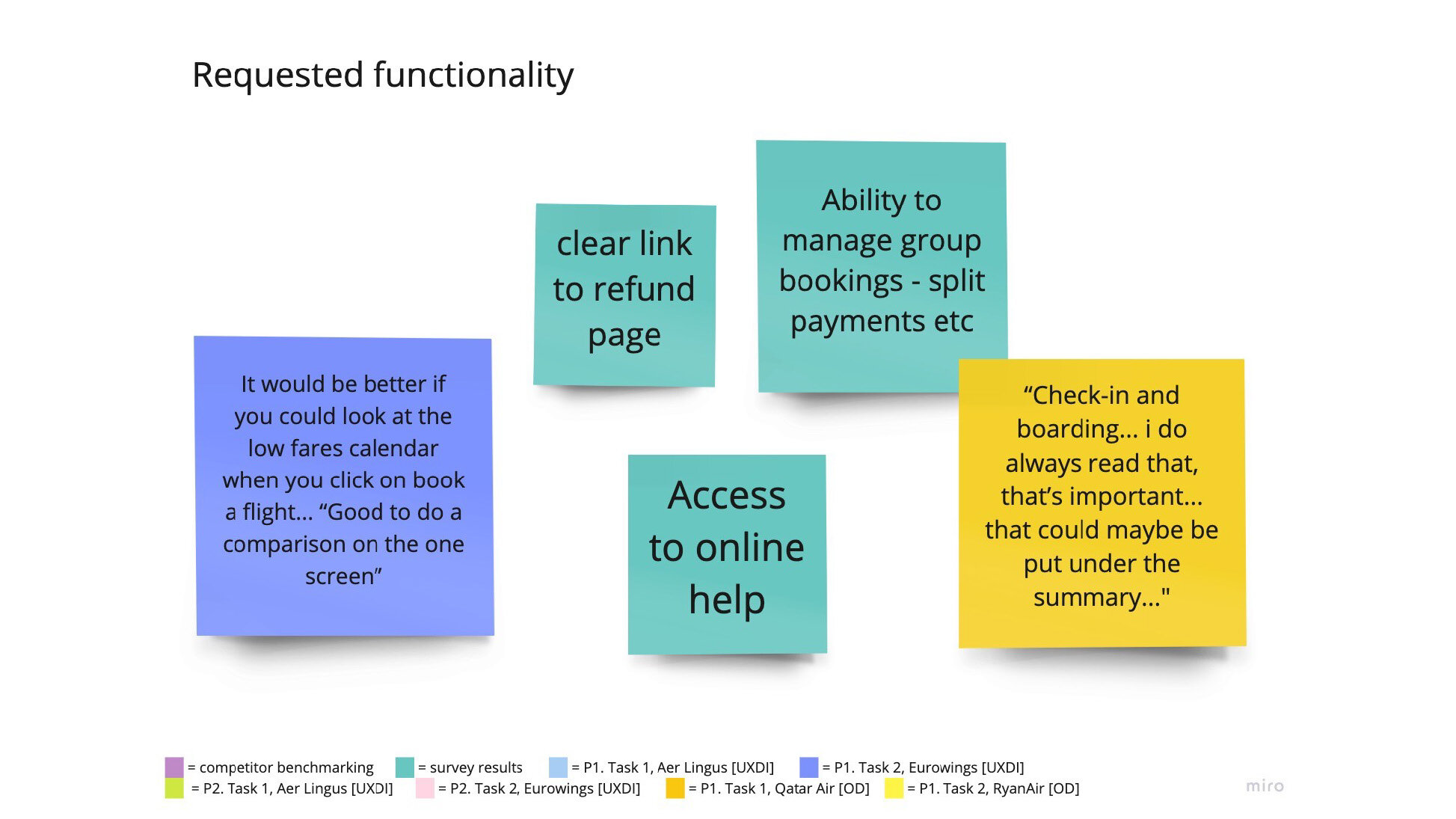
Affinity diagram for Fly UX
So this was a very new area to me, can definitely say I have never sat down and analysed qualitative data before – as a graphic designer I have presented data a lot… but not got deep down and nerdy. I actually loved it and got quite obsessed with trying to pull out every useful morsel.
We looked at several frameworks and techniques that can be used to process data
The importance of triangulation (using multiple sources of research)
Affinity diagrams
Customer journey maps
Personas
Customer value curves
Empathy maps
Affinity diagram
This is the first analysis technique I used. (The technique was created in the 1960s by Japanese anthropologist Jiro Kawakita.)
Now, I am aware that my process was far from perfect. Again due to my personal situation it was impossible to ask for someone else’s time to help trawl through all my data, so I did a lot of it on my own - yup, massive personal bias going on, I know, but I did ask my partner to chip in here and there too.
I actually really enjoyed the process. I took a few days to do it – left it alone for a bit, then returned to see if I spotted a new pattern or wanted to change my mind about something (I know you’d rarely have that luxury in real life). Can’t wait to be part of a proper session with other people.
I used digital post-it notes in Miro.

Adding all the notes onto the board in no particular order (I had started adding a code for users emotions too, but decided that was all a bit too much at such an early stage of analysis so removed later on.

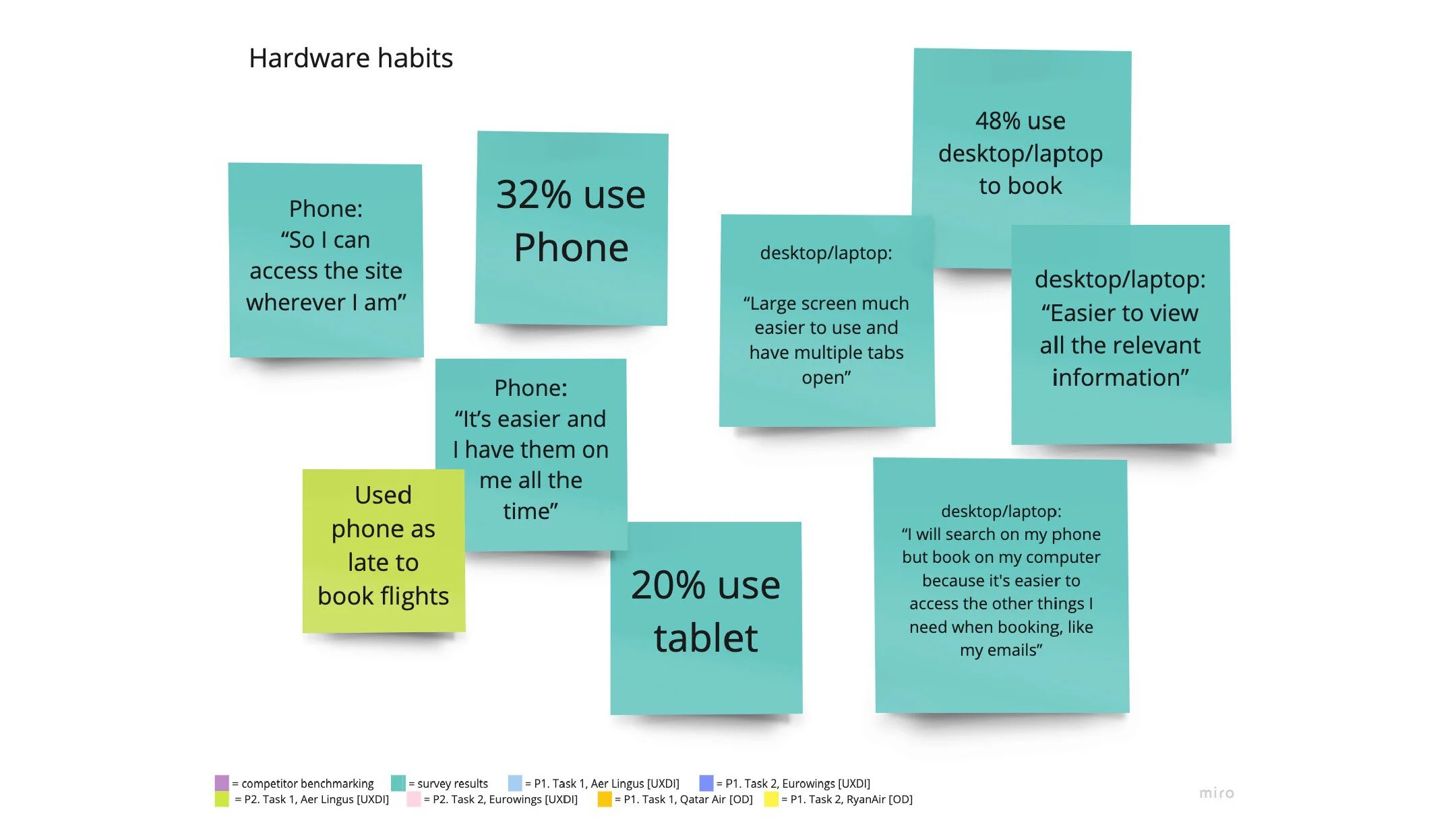
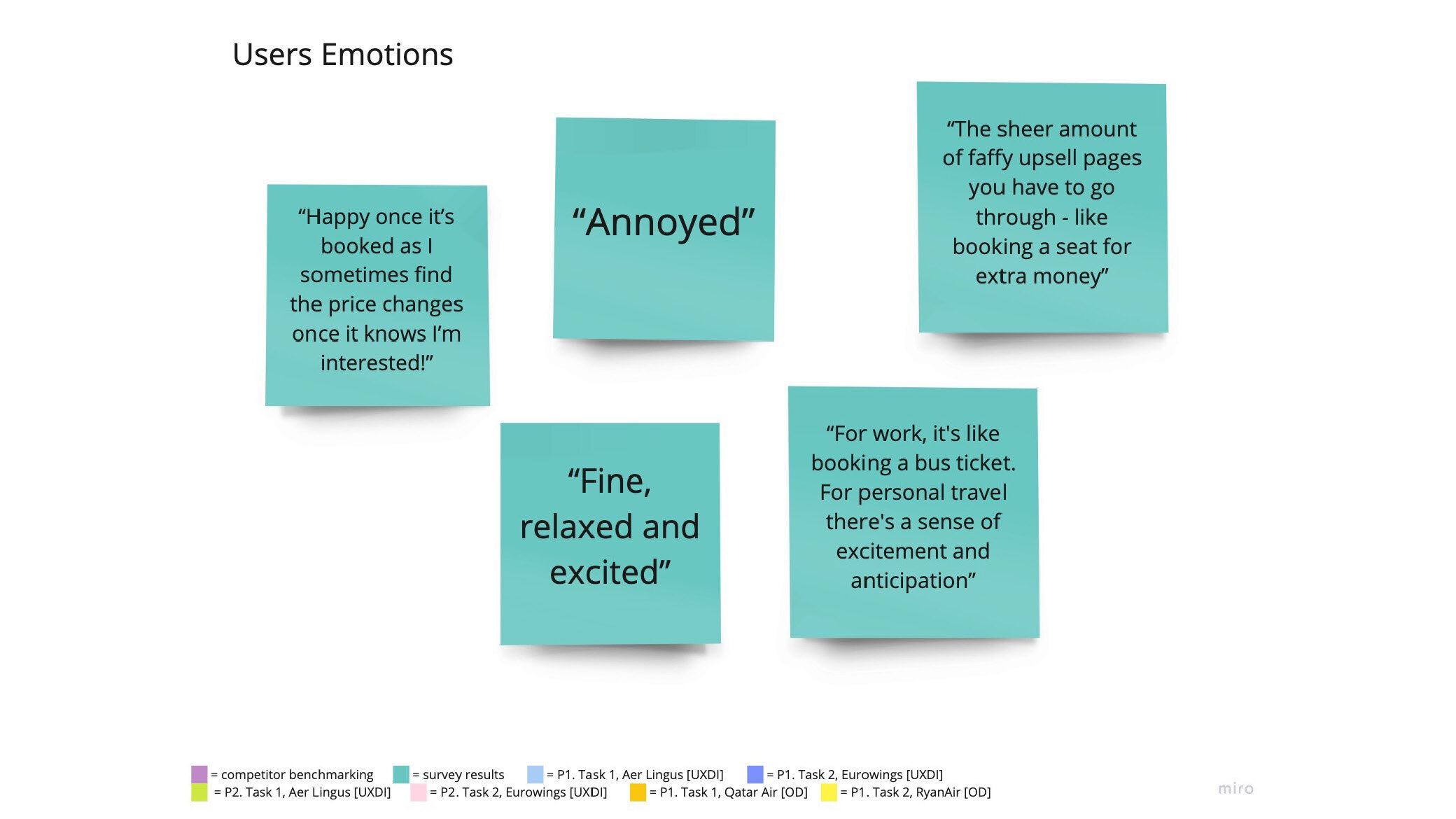
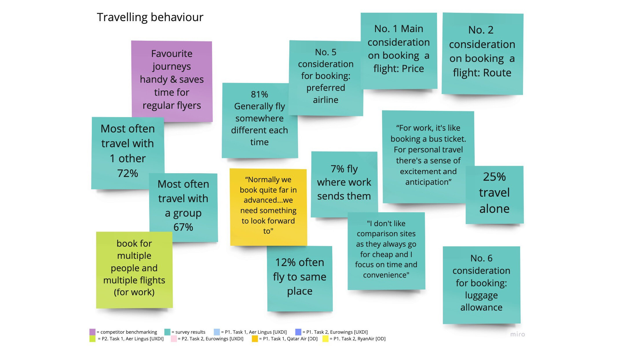
Collating the post-its into different patterns
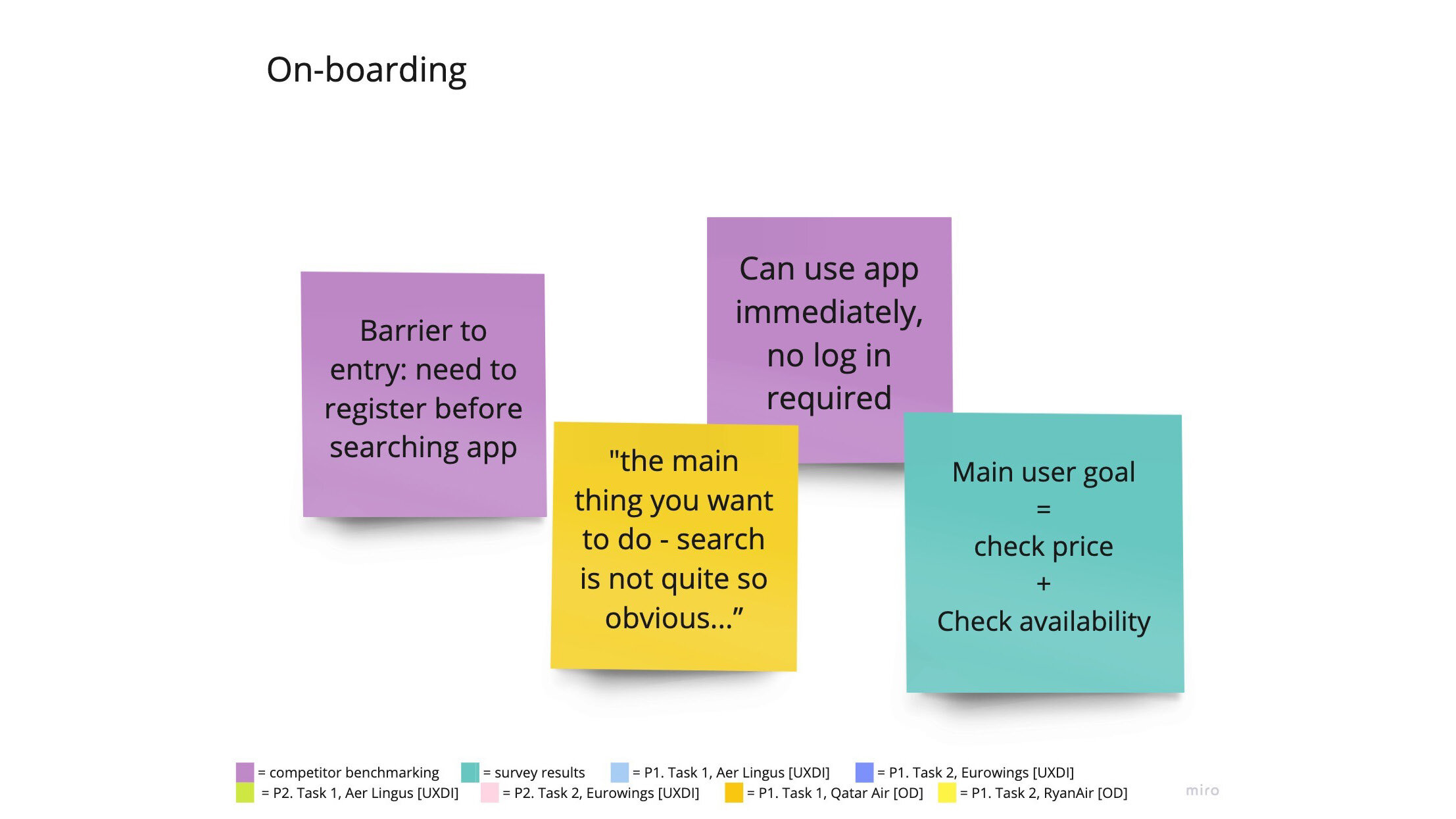
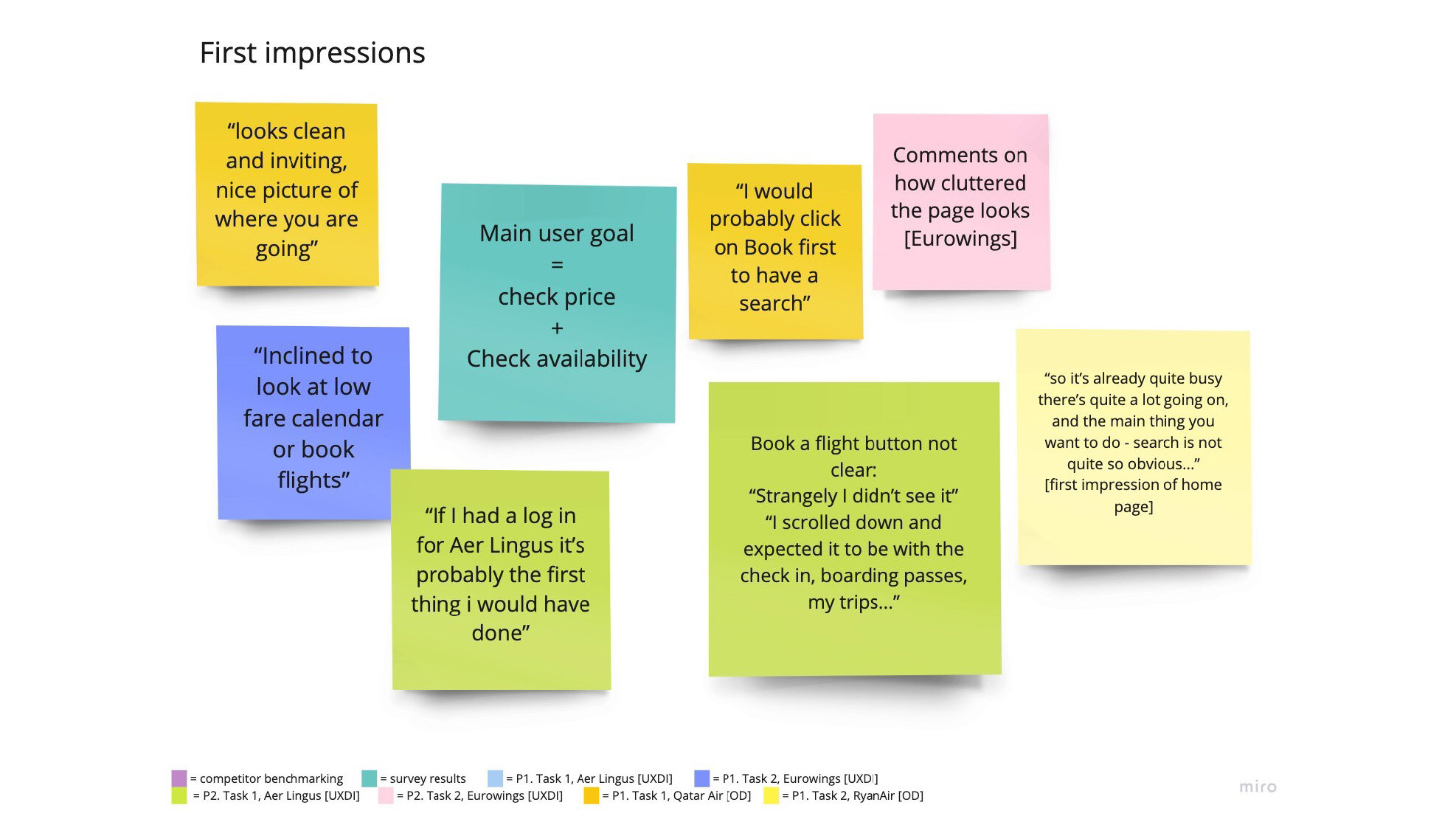
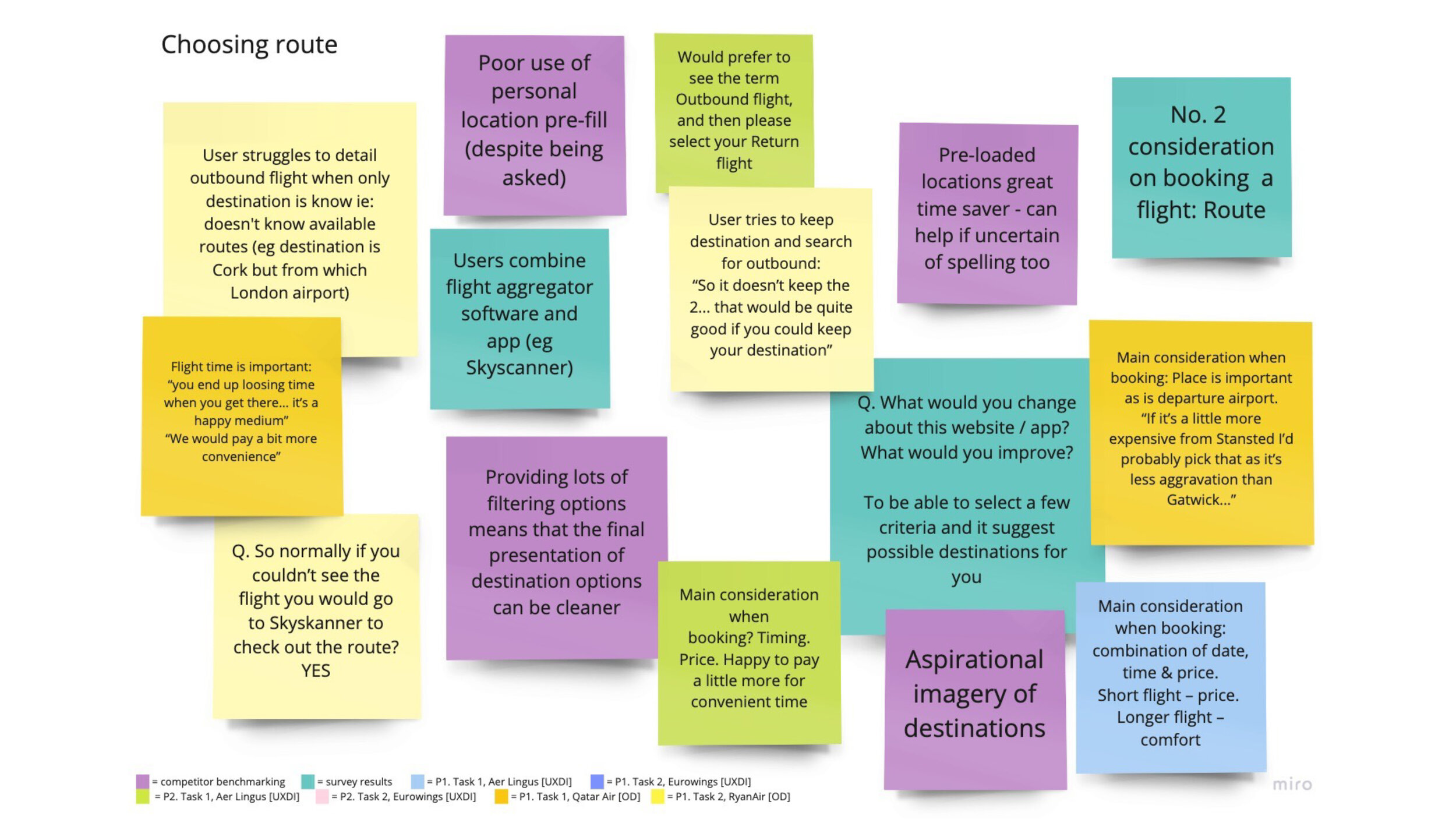
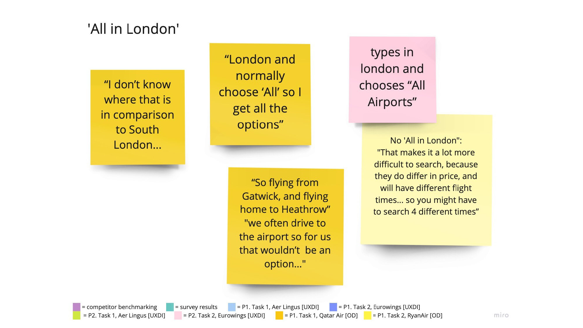
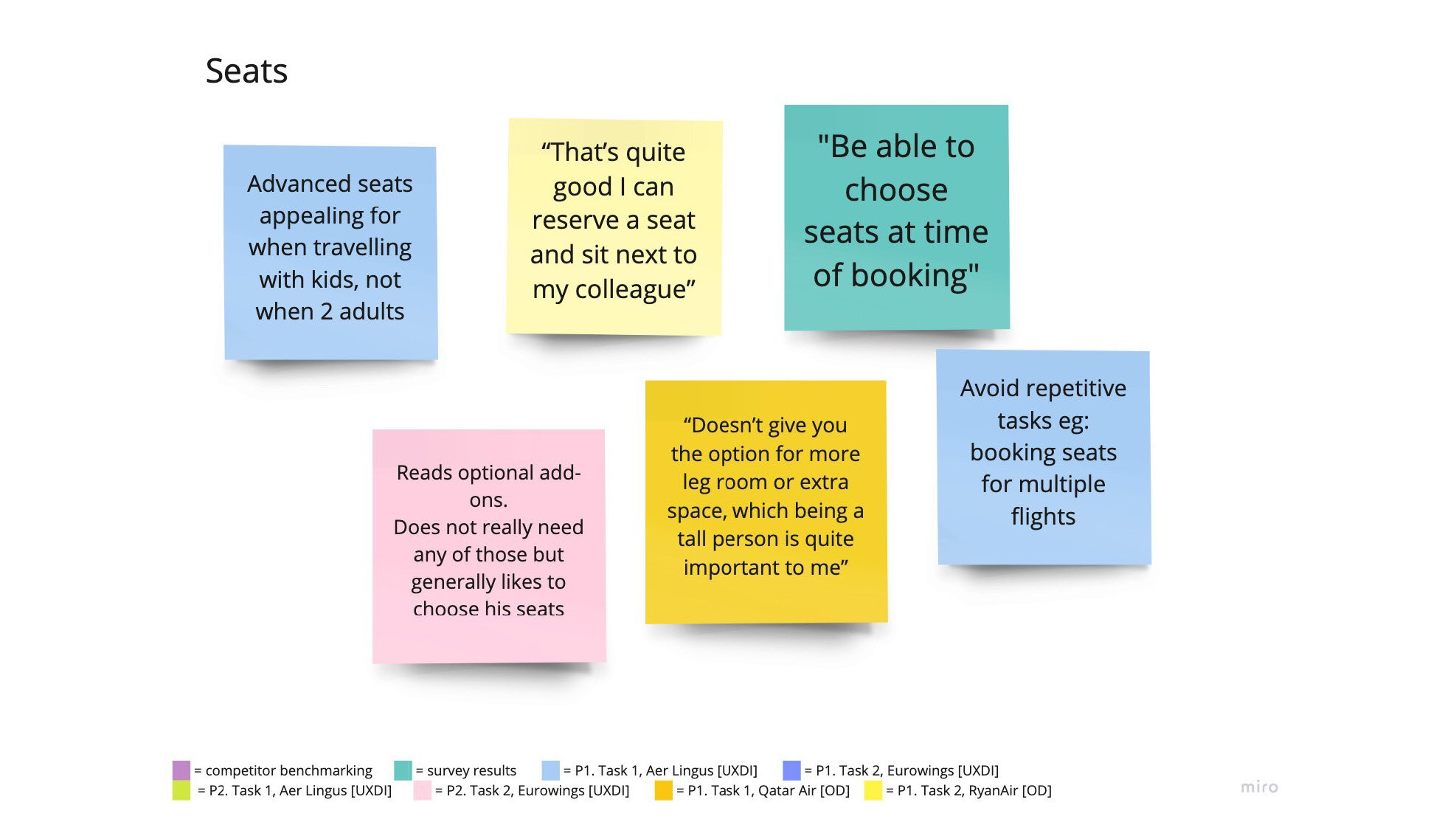
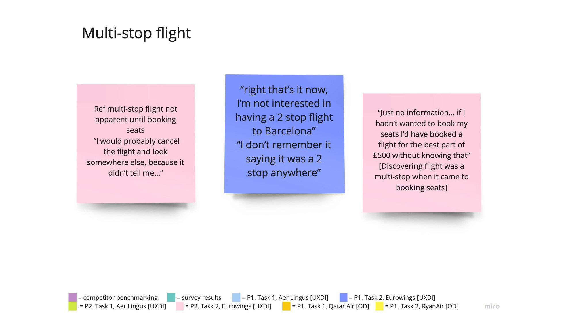
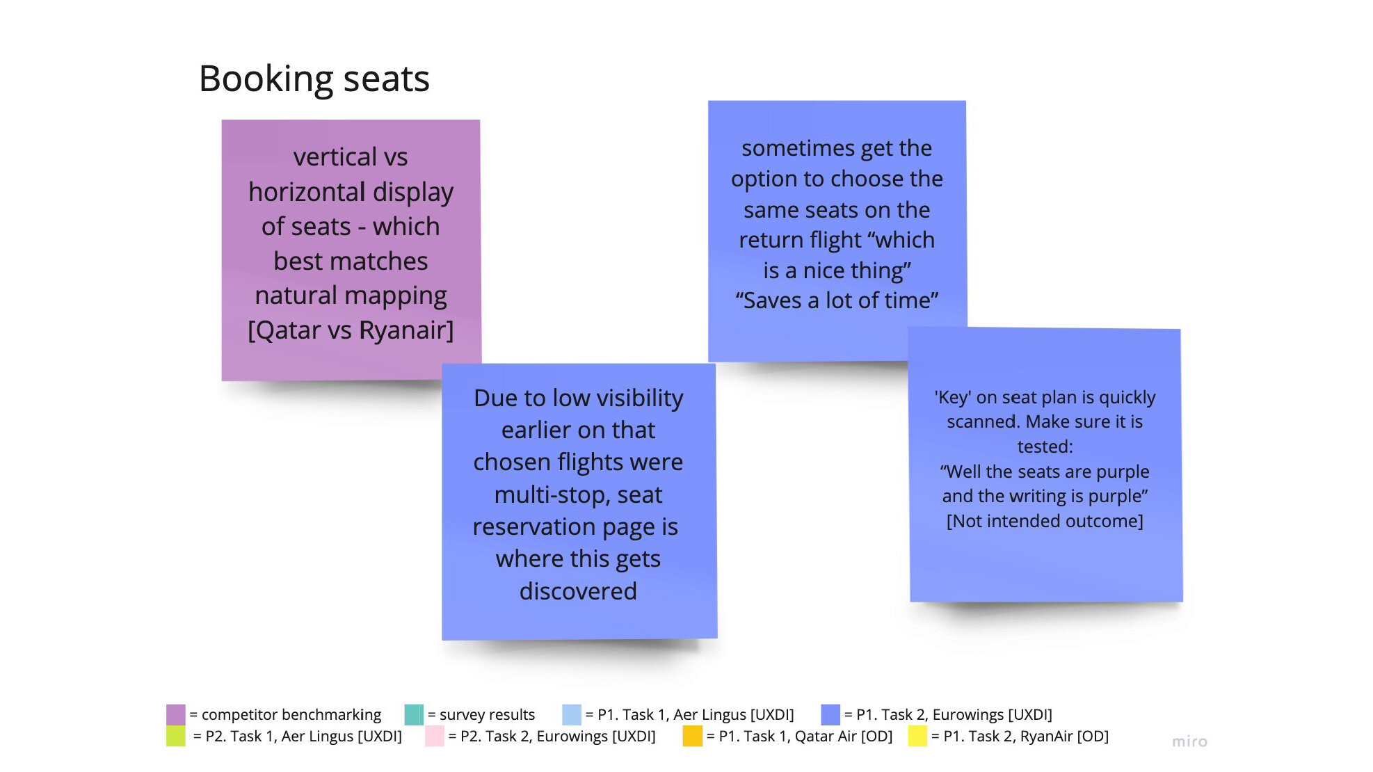
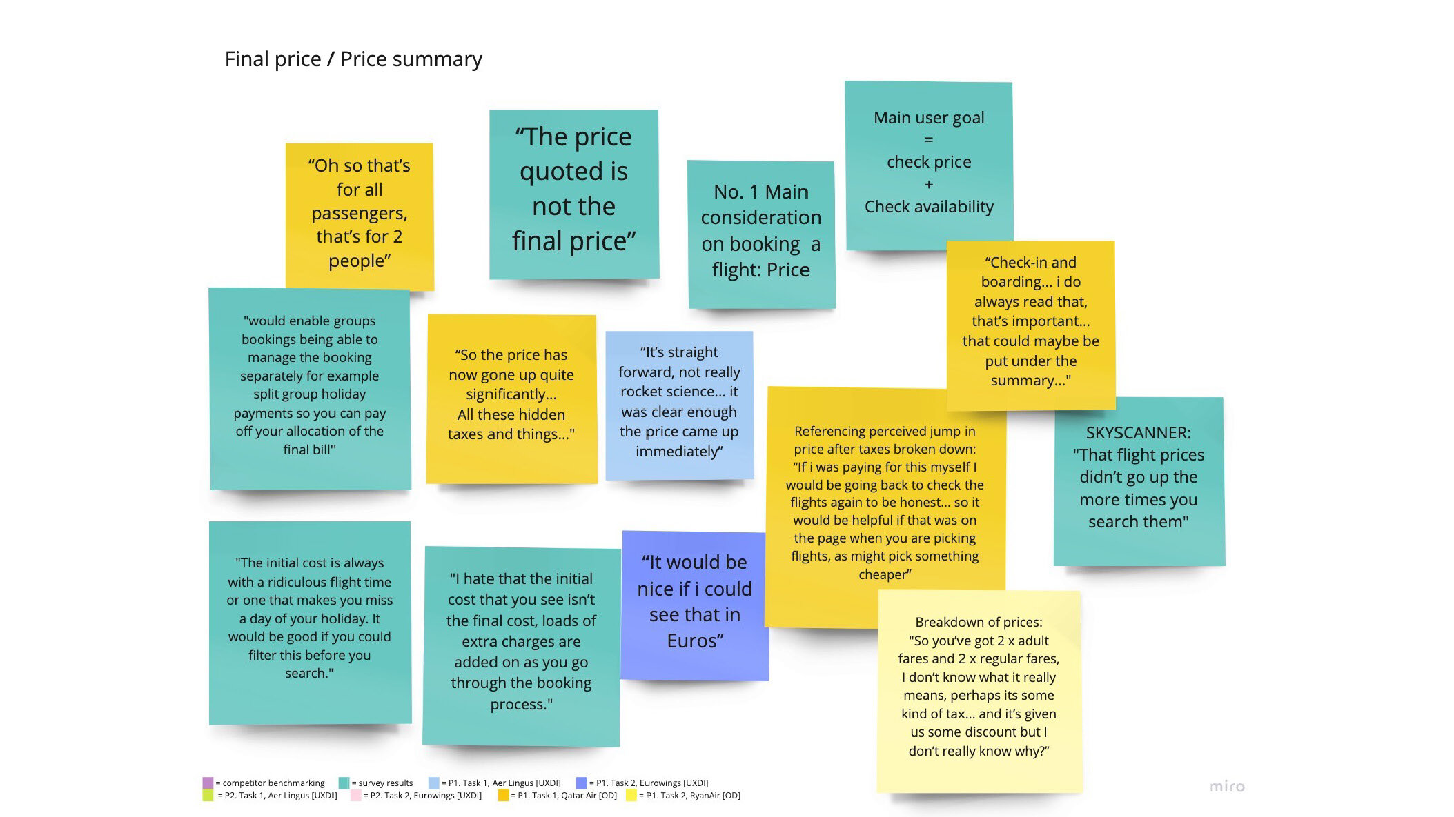
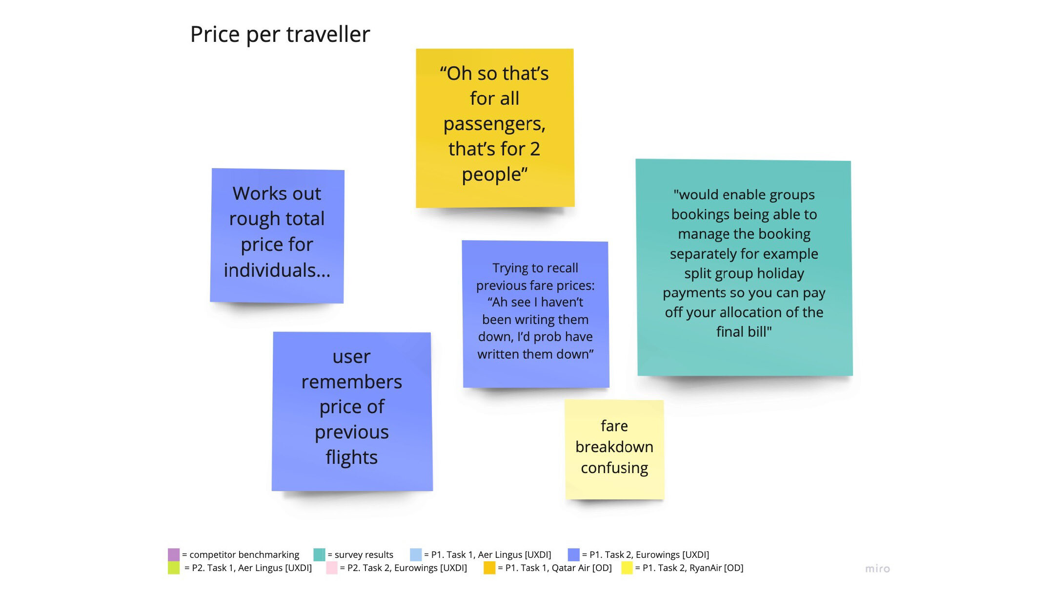
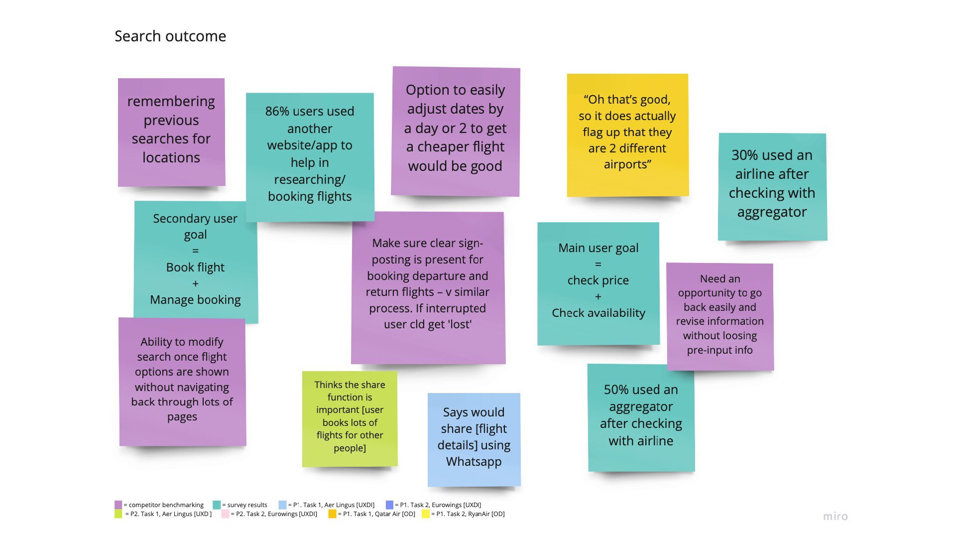
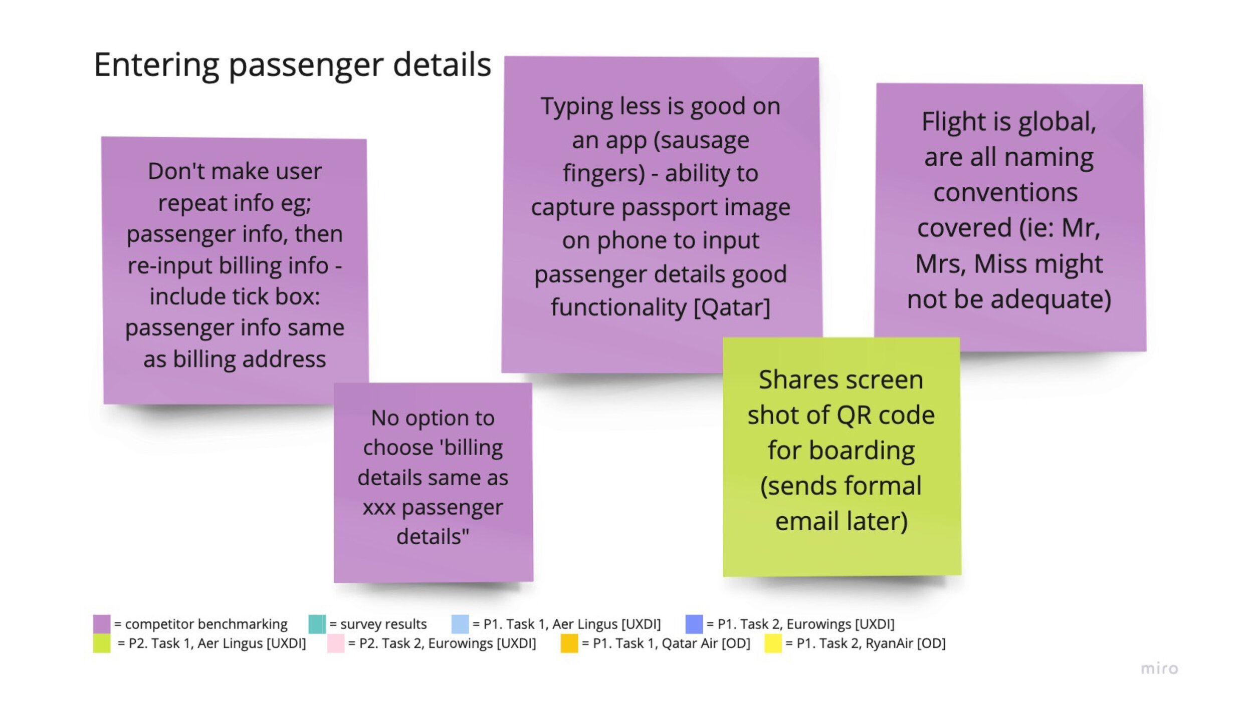
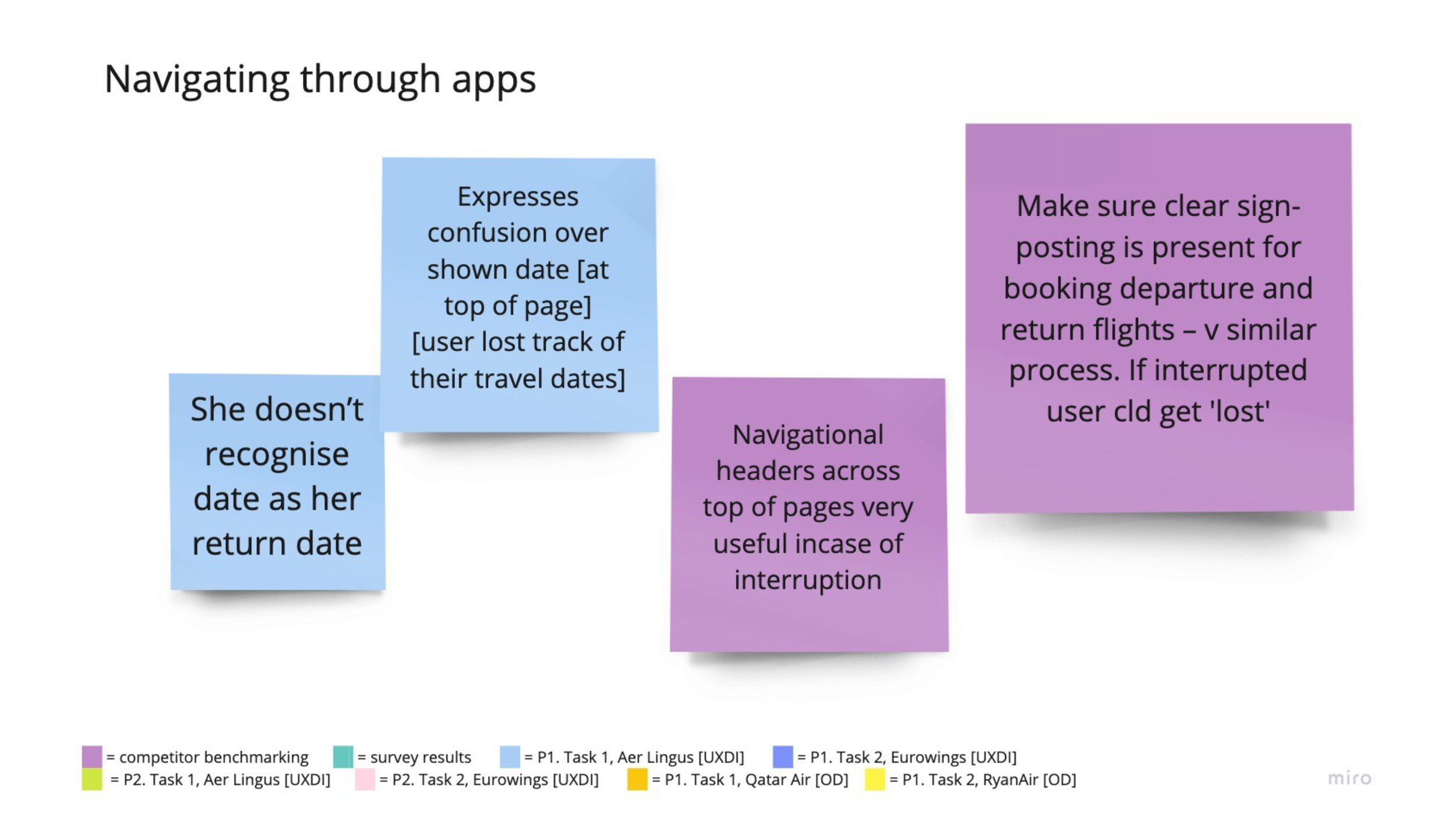
The final presentation below: